My Role
Lead UX/UI
Product Designer
Prototyper
UX Researcher
UX Writer
Timeframe
2 Weeks
Aug 2020
UX Bootcamp
Solo Project
Tools Used
Adobe XD
Miro
Google Forms
Adobe Illustrator
Adobe Photoshop
Don't feel like reading?
OVERVIEW
The Client
The Brew Lab is a family-owned beer distribution company with a store in a small city, serving their community since 1990.
- They are a beer-loving family and recently opened up a small microbrewery and sell their own craft beers and branded merchandise
- Carry a wide selection of domestic & international beers as well as supplies (cups, ice, and glassware)
- They sell all their beer wholesale to local businesses
- They love dogs~
The Problem(s)
- Their current website is outdated
- They don’t have an effective way for customers to shop online or to advertise their products
- Customers are unaware they offer 1 Hour Pick-Up or Same Day Delivery
The Strategy
- Create a brand identity for this fictitious company
- Research and understand competitors, current products, and customers
- Structure, Design, and Prototype a website that's user-friendly, straightforward, and accessible to local and business customers
- Test prototype and iterate based on test data
RESEARCH
Survey #1 "IPAs are trash!"
To better understand the consumer I surveyed 11 beer drinkers on their current beer drinking and buying habits.
90% of consumers have never had beer delivered BUT would be open to it
54.5% of consumers prefer to drink beer in bottles while 18.2% preferred canned beer
The Top 3 Places our Consumers buy beer:
90.9% of consumers buy their beer from Grocery Store chains such as Trader Joe's, Stop & Shop, Costco, etc.
81.8% of consumers buy from their local Corner/Convenience store for their beer
72.7% of consumers would rather buy from a store that has a combination of Beer, Wine & Liquor
The Brew Lab will be a hybrid specialty beer store and brewery only 27.3% and 54.5% of consumers respectively said they would purchase their beer from there.
I remained optimistic as 72.7% of consumers called out they would be willing to pay more for beers if it helped to support small local business.
Top 5 Features consumers want:
- 72.7% of users want Same Day Delivery
- 72.7% of users want Cold Beer sold in store
- 63.6% of users want Contactless Curbside Pickup
- 54.5% of users want Brewery Tours
- 45.5% of users want a Rewards Program
For my Minimum Viable Product, I decided to focus on Same-Day Delivery and Curbside Pick-Up options as the main features to test while keeping in mind the other featured for the future-state of my project.
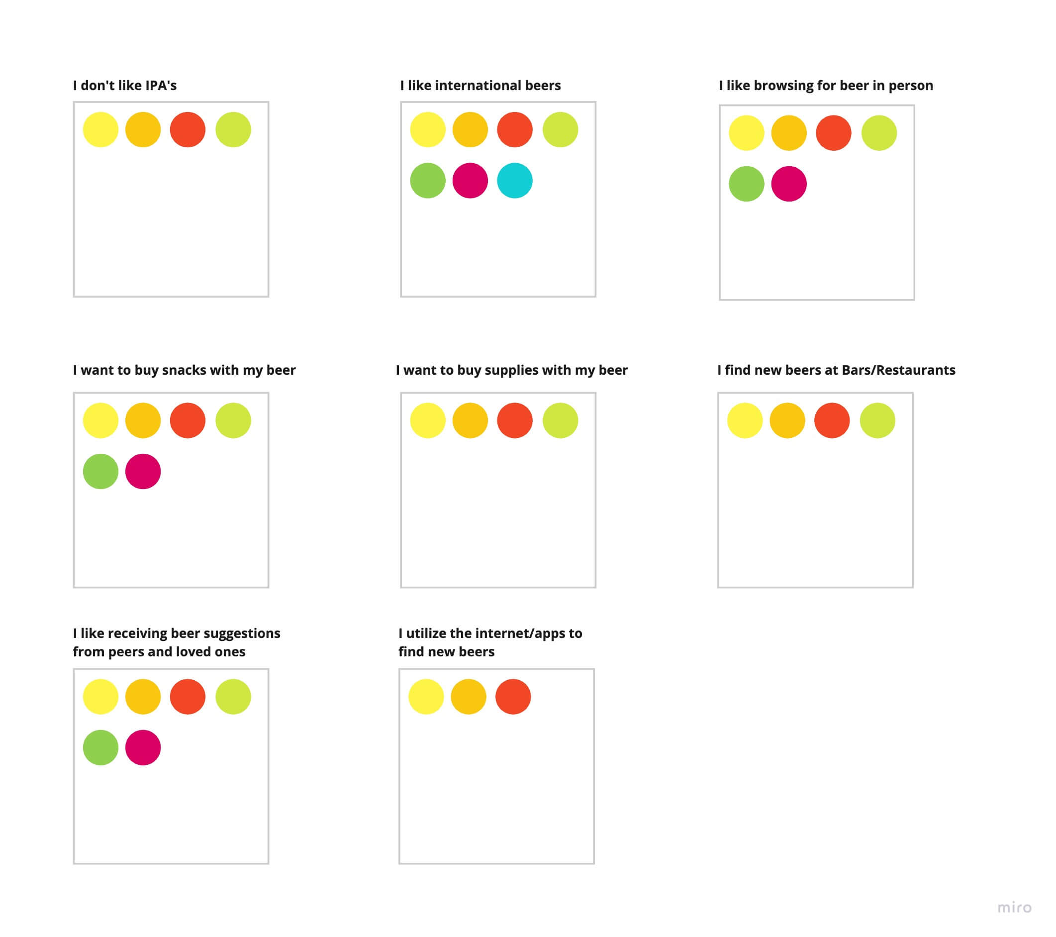
Affinity Map Findings
- Customers want to be able to buy things other than beer (supplies/snacks)
- Customers trust and want recommendations from friends, family, and peers
- Pre-Covid customers relied on bars & restaurants for discovering a new type of beers
- Customers called out international beer brands the most while IPAs (India Pale Ales) were specifically called out by consumers as being their least favorite
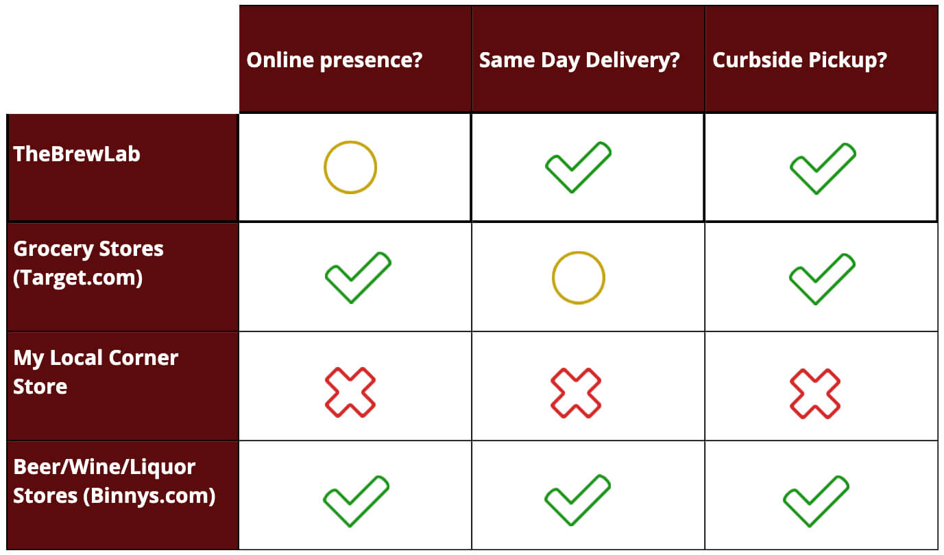
Now that I had a little more insight into the mind of the consumer I wanted to learn about The Brew Lab's competitors and how they stack up:
The Brew Lab's Competitor Feature Analysis
Key Takeaways:
- The Brew Lab's lack of online presence is what's missing to put it on par with Binny's who checked all the boxes on features we are looking for
- Target does offer same-day delivery but only if you download their mobile application
- Even though it was the second most popular option on where to buy beer my local corner store didn't have any of the features we were looking for
Survey #2 "Let's get down to business!"
To better understand business user needs I surveyed 6 business users on what they would find useful in a vendor portal.
- 100% of users wanted an electronic way of sending purchase orders to The Brew Lab
- 67% would prefer their own separate login to access their account
Main features business users wanted:
• Buy Beers in Cases, not Packs
• Wholesale Prices
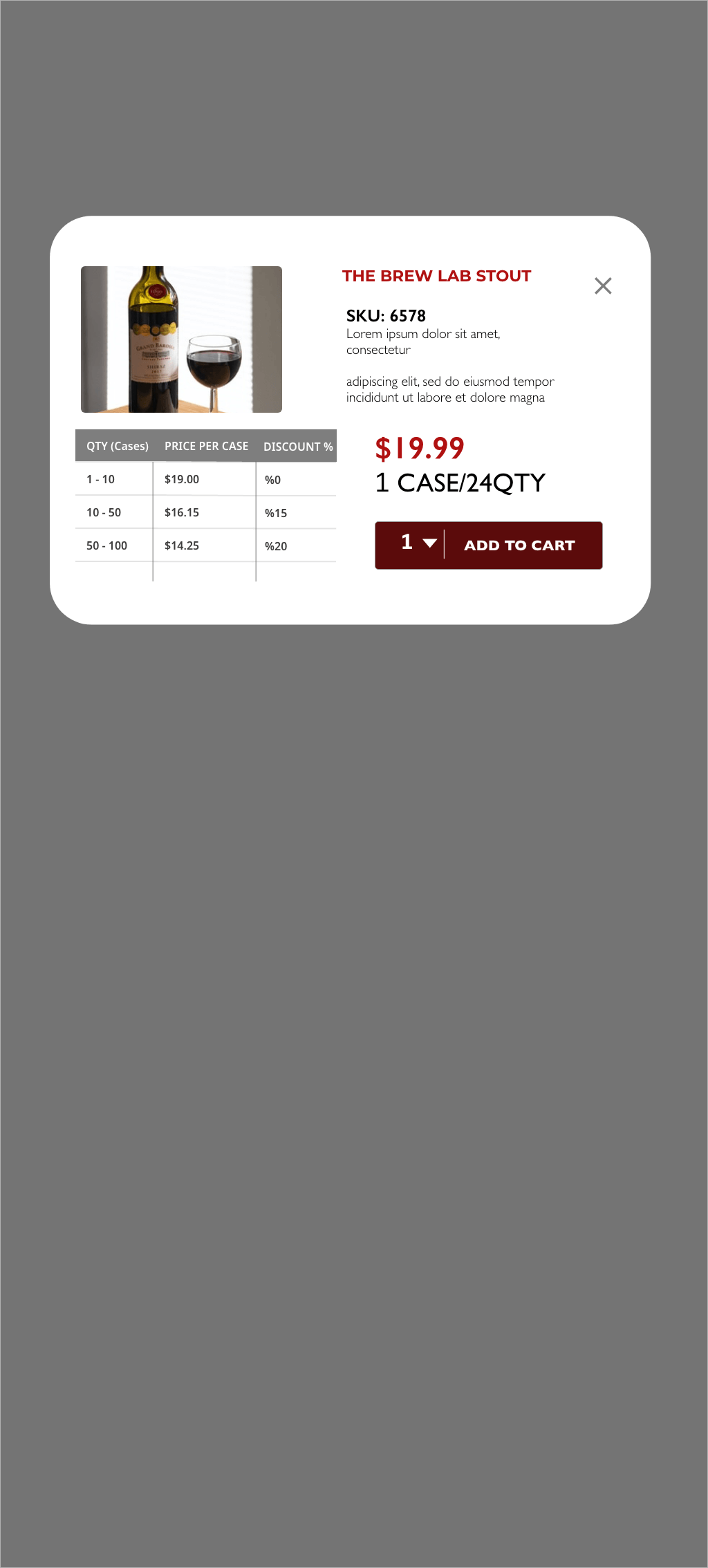
• Quantity Discounts
• Option to view previous purchase orders and quickly re-order
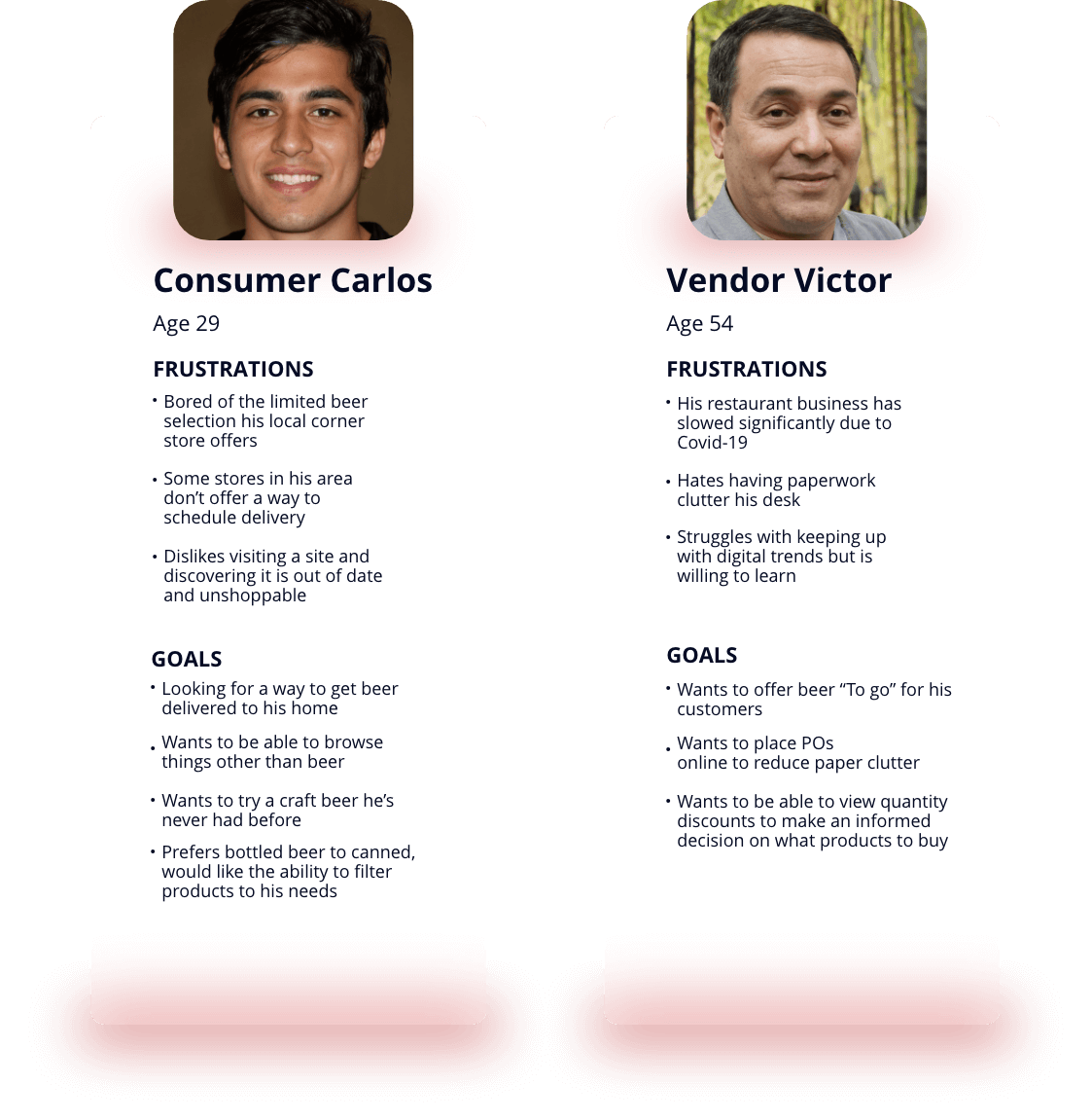
The Brew Lab Personas
From my survey data and research, I was able to determine 2 types of personas The Brew Lab would cater to with their website.
The local customer "Consumer Carlos" wants to be able to buy beer online and have it delivered in the morning. He is frustrated with the limited offerings of his local convenience store
The business owner "Vendor Victor' who owns a bar/restaurant in the same city as The Brew Lab and wants to buy craft beer wholesale so that he can offer “to go” options for his customers.
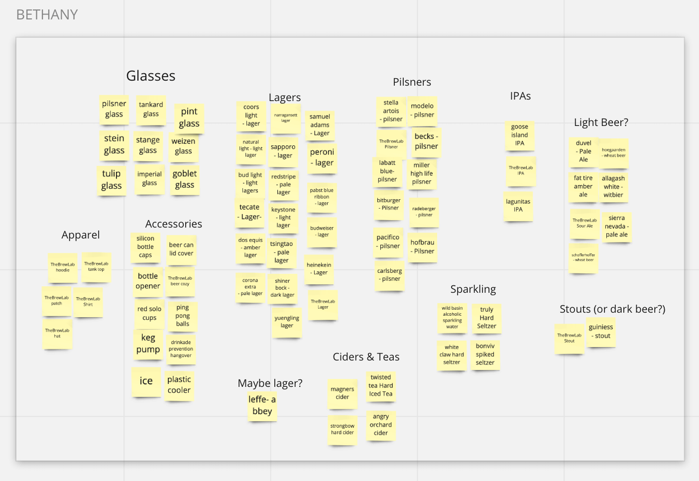
Open Card Sort
"The category is..."
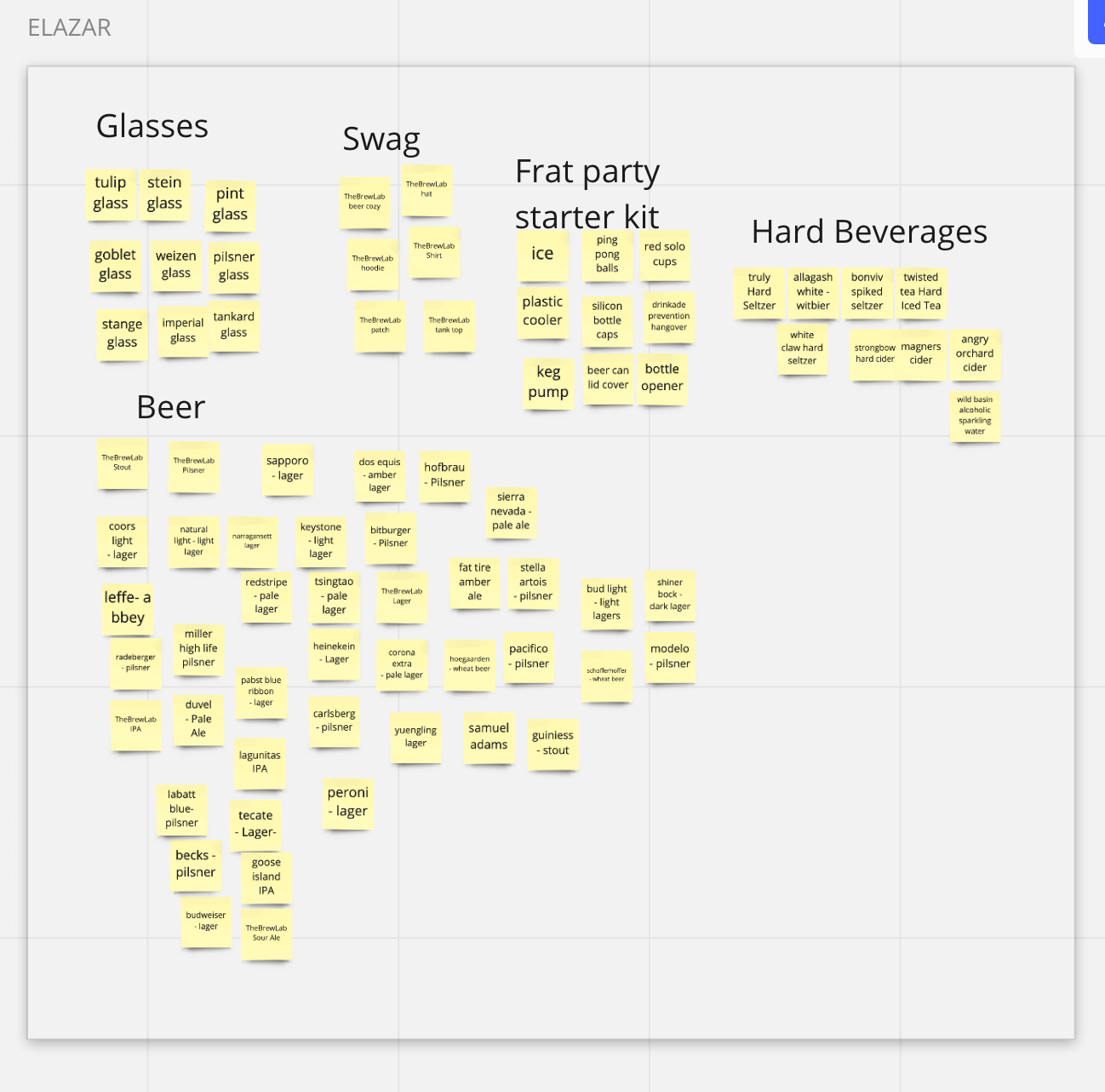
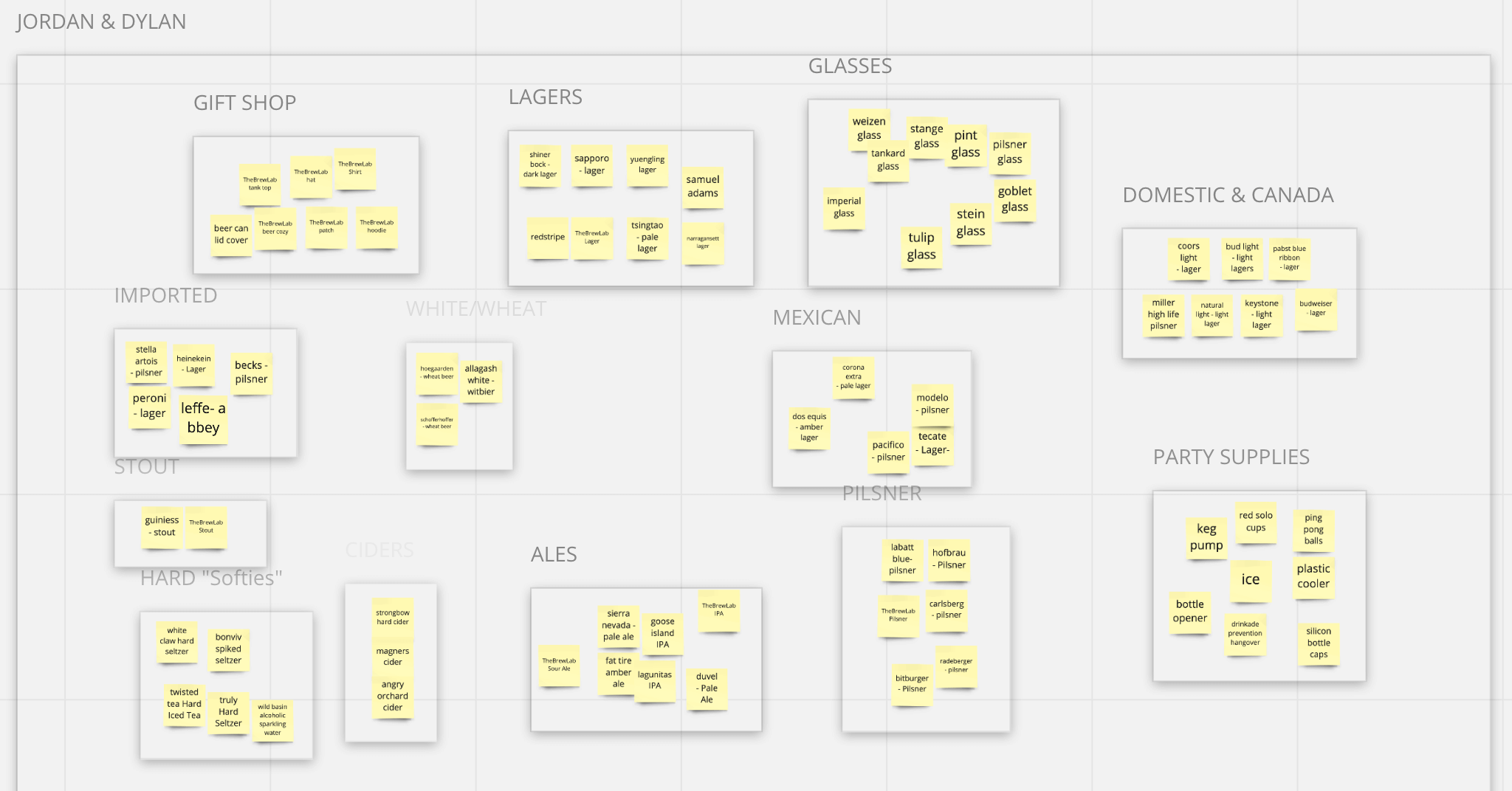
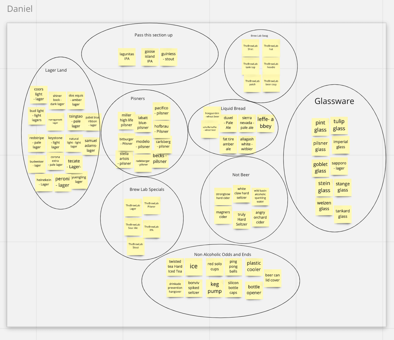
From my previous research, I chose 75 products that The Brew Lab will offer to its customers.
5 users participated in an open card sort on Miro and were asked how they would group these products.
Main Takeaways
- Most wanted to sort beer by type (ales, pilsners, etc..)
- Non-beers such as ciders and hard seltzers were grouped in the same category
- TheBrewLab's own craft beers and branded merchandise was grouped in a single category
These findings would play a key factor in how I would later name my website categories.
DESIGN
The Brew Lab Branding
"Who are you anyway?"
Before I could create anything for The Brew Lab I needed to understand who they were as a company.
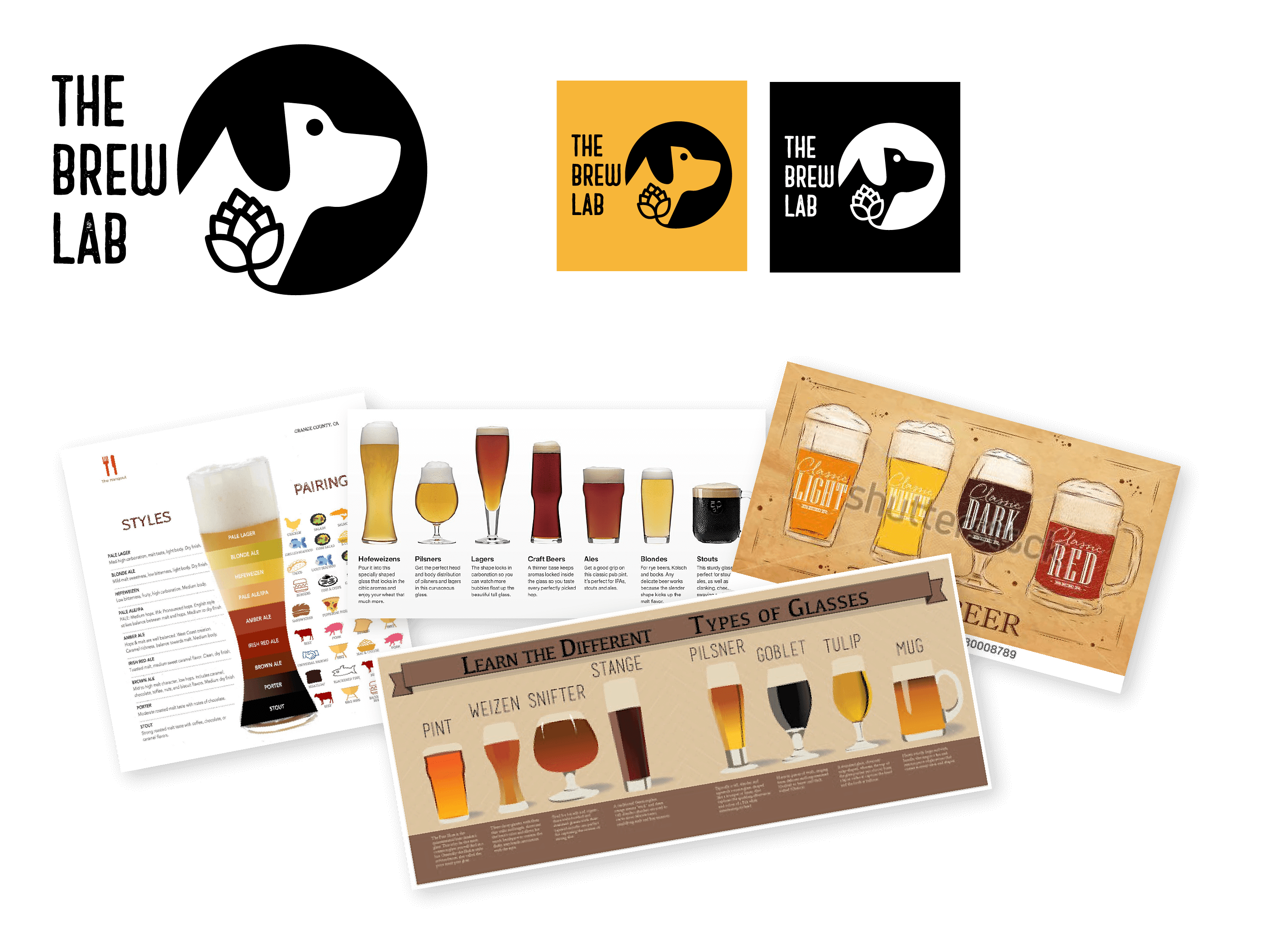
For 2 days I mulled over the name. I searched for synonyms for beer, I visited my local grocery store for beer name inspiration. "Hop Emperor?" "Beer Lovers?" "We Hate IPAs??" finally somewhere in my brain I landed on "The Brew Lab" and at first I thought about giving it a science angle but because our brief mentioned that this would be a family-owned company why not take it the other way and have lab stand for labrador? Every family needs a dog and thus my logo mark was born: The Brew Lab in a slightly textured sans-serif font with a labrador dog in a circle featuring a beer hop.
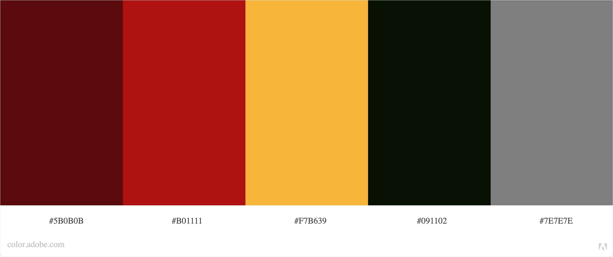
I created a Brand Identity based on design inspiration from other local brewery websites along with just being inspired by the different colors beer can actually come in. I ran my color palette through Adobe's Color Accessibility checker just to be sure there weren't any color conflicts with my choices.
The Brew Lab Product Mockups
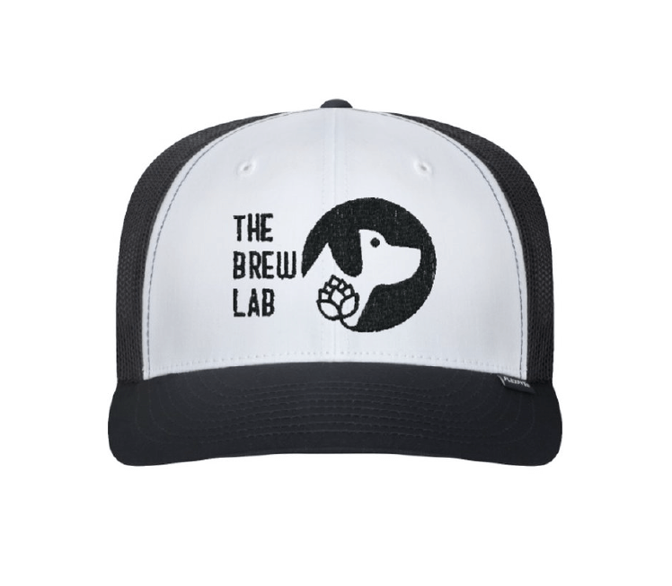
Now that I had a better understanding of The Brew Lab's brand and voice it was all starting to come together and I was able to clearly see this local, home-grown, fun, pet-friendly company. I was excited to explore mocking up some of the branded products that they would offer based on my product list.
Did I give more work for myself? Yes. This did however help me to understand the brand better and flex my Photoshop muscles.
What did the people say?
When I asked our usability test participants "What words would you use to describe this website? Their answers were:
The Brew Lab Current Sitemap
To help me better understand how the website should be laid out I created this sitemap. The usability test I created for my consumer users would help to highlight some pain points with this current layout.

Consumer Carlos' Happy Path
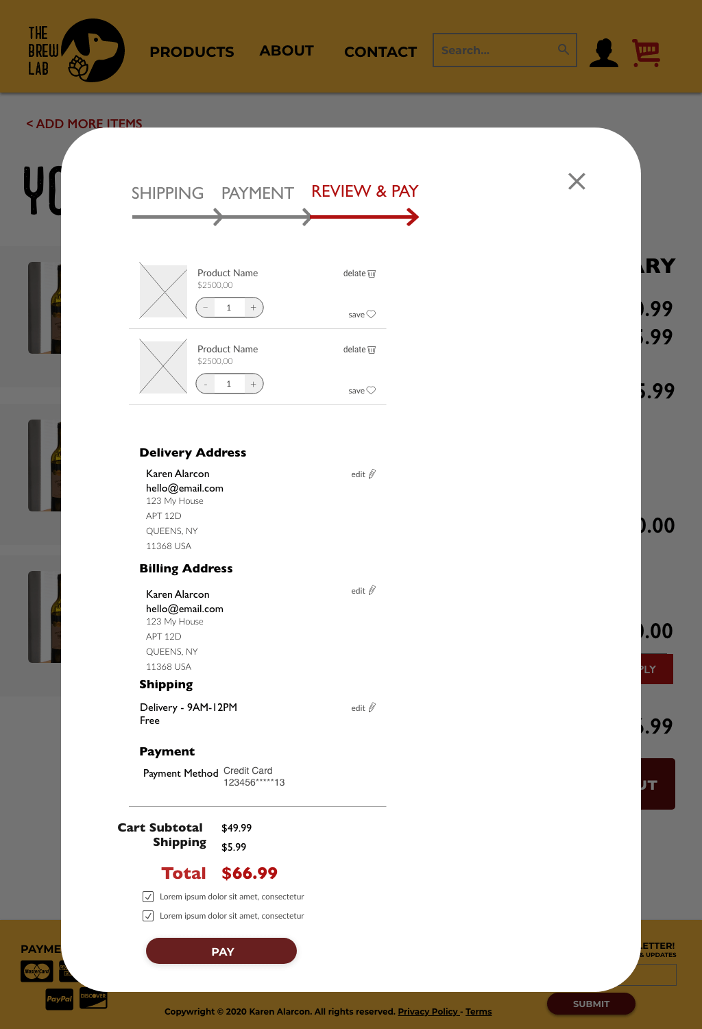
This video shows us how Carlos would navigate from the home screen to adding 3 items to his cart, selecting a delivery window time slot, and checking out his order.
Consumer Carlos' Usability Test Results
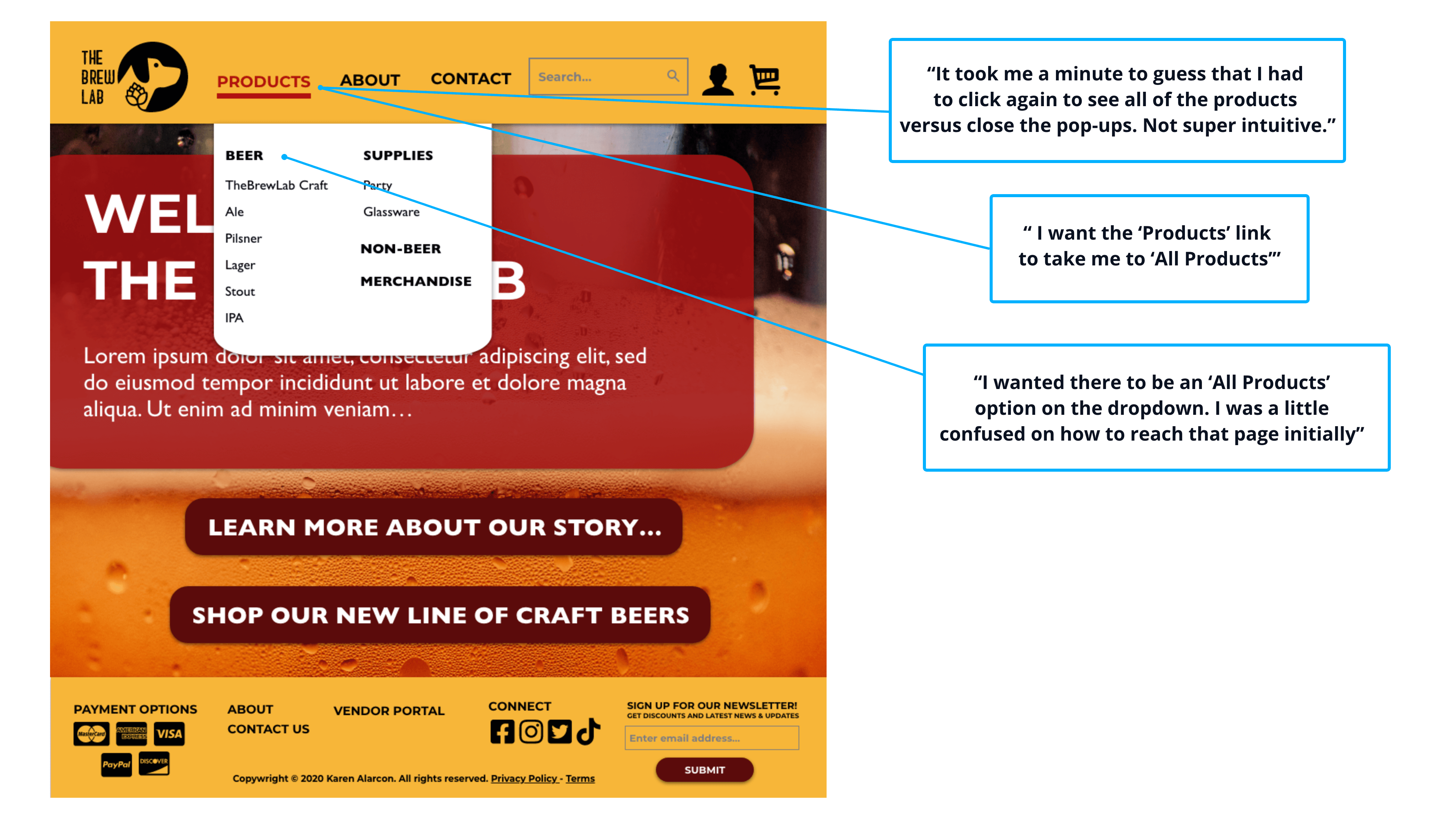
Using 6 Participants I gave them 9 tasks to complete to mimic Carlos' happy path. 2 participants were unable to complete the prompts. In my prototype, I created an unnecessary double click that was confusing my participants right at the beginning. The 4 participants that overcame my fumble reported that they were able to complete the task with no other known issues.
The Brew Lab Prototype
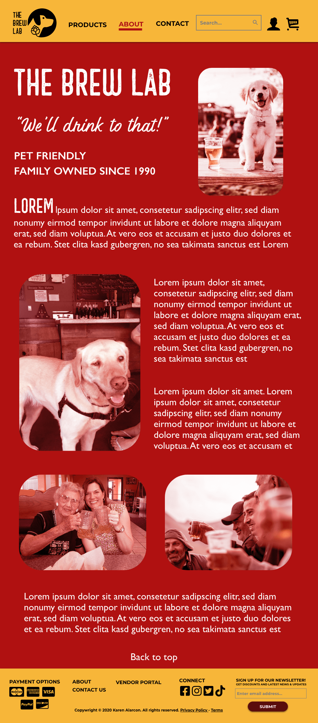
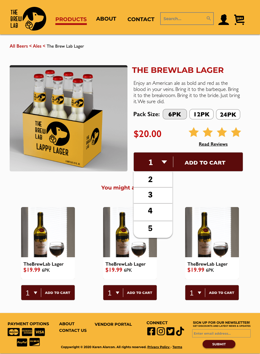
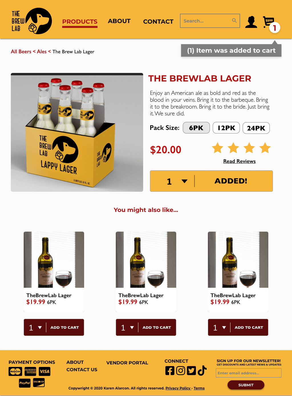
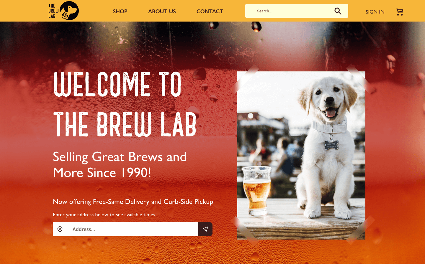
Check out my prototype in its current state. You can also view the prototype in your browser by clicking this link.
- Check out the "About Me" page
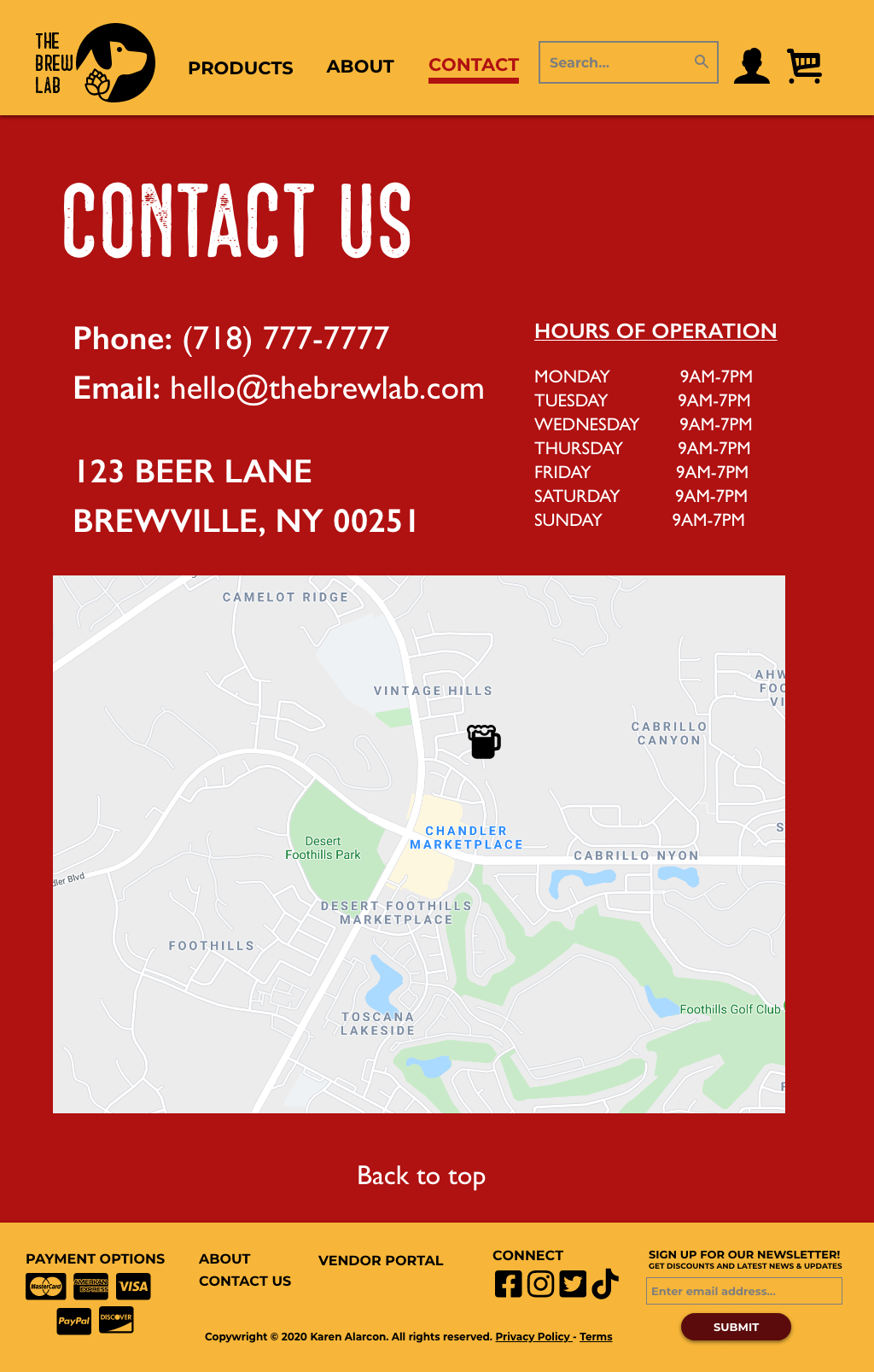
- Check out the "Contact" page
- Find the "All Products" page
- Find "TheBrewLab Lager " and add it to your cart
- Find "TheBrewLab Sour Ale" and add it to your cart
- Find "TheBrewLab Hat" and add it to your cart
- View your shopping cart
- Select a delivery time of 9 AM -12 PM
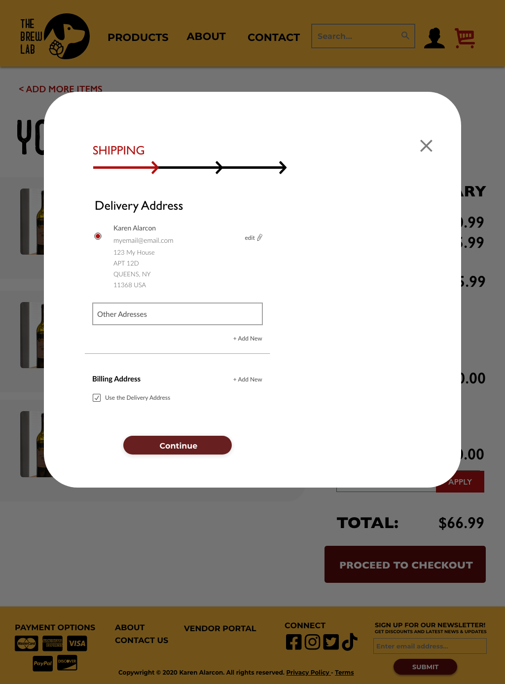
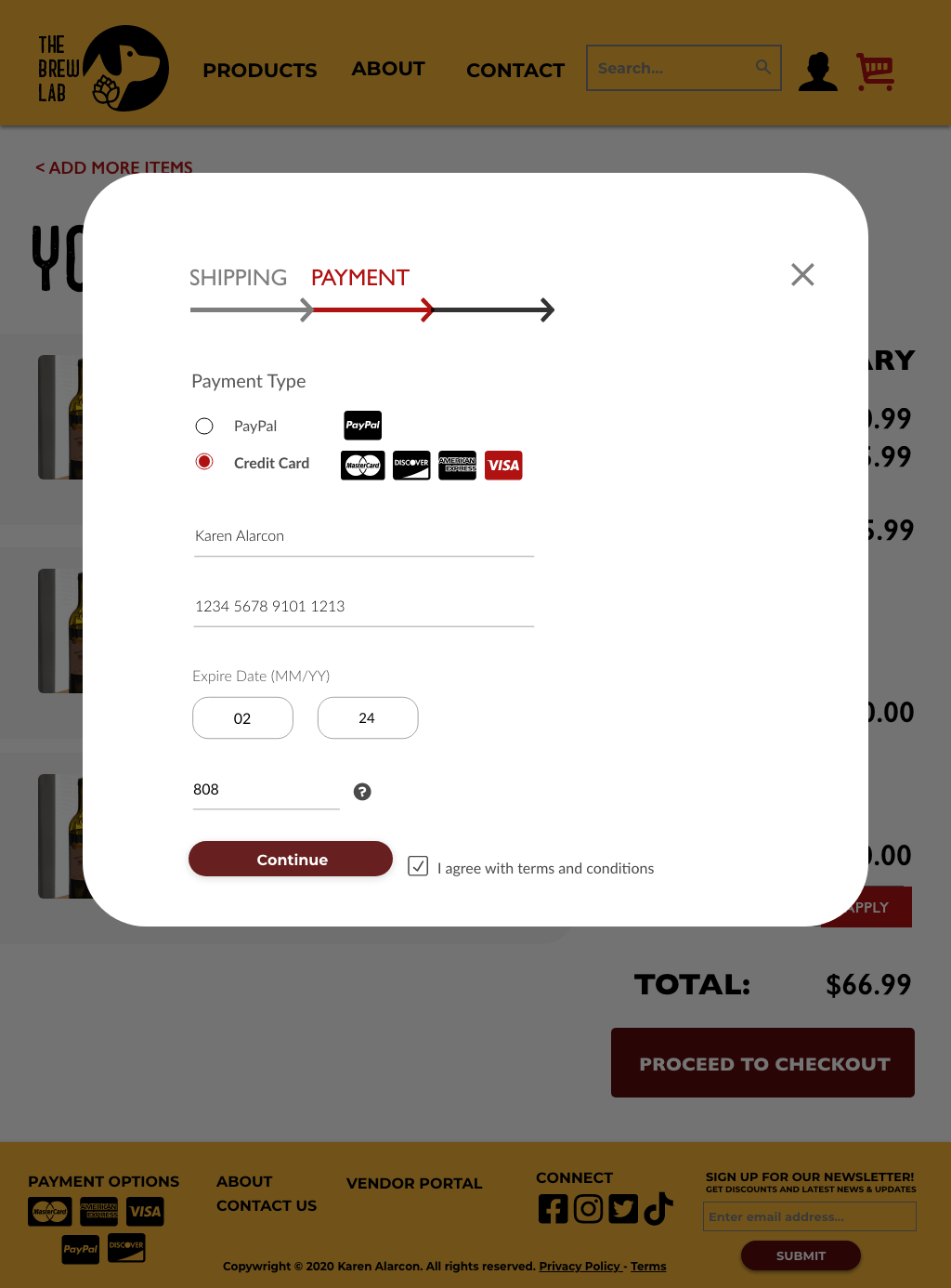
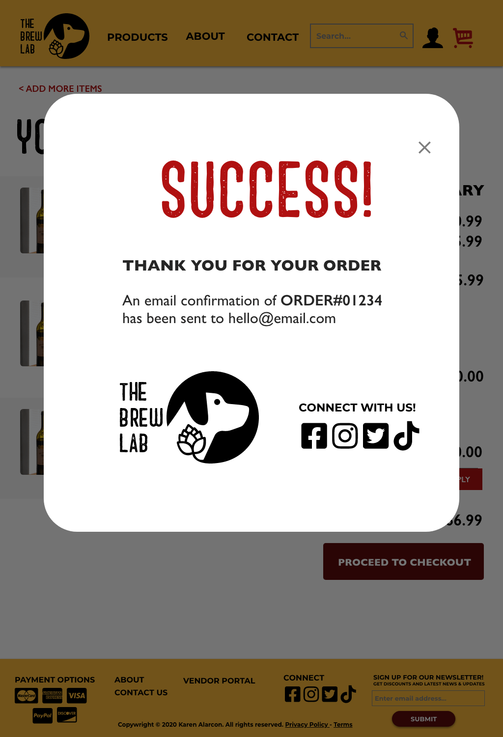
- Continue with the checkout process until you see SUCCESS!
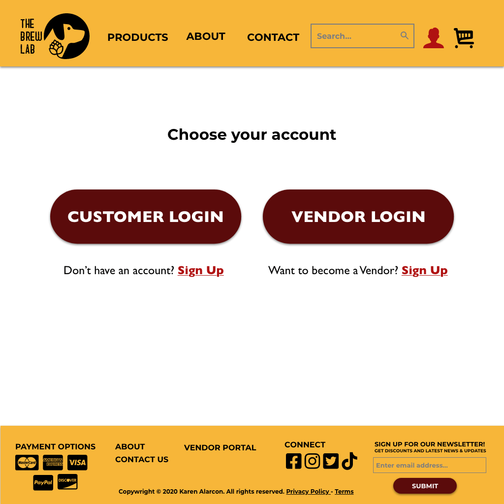
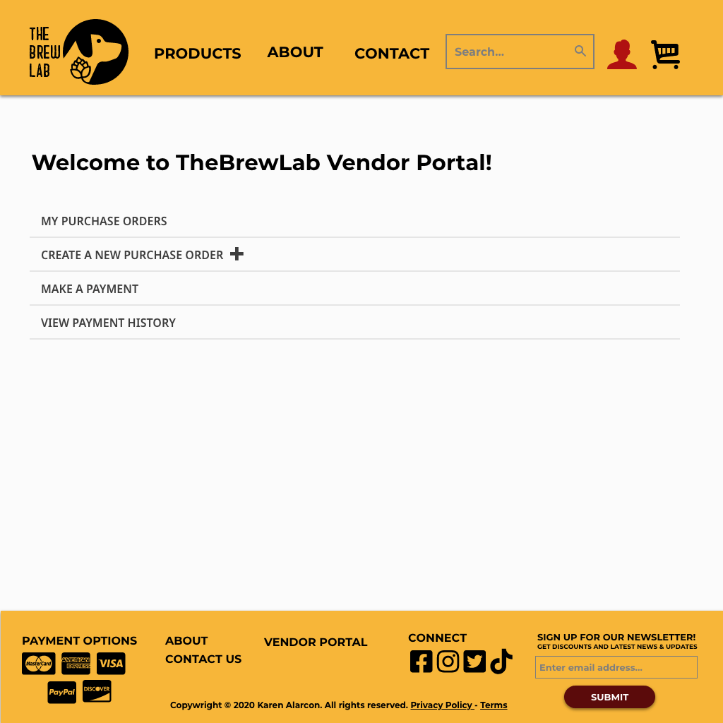
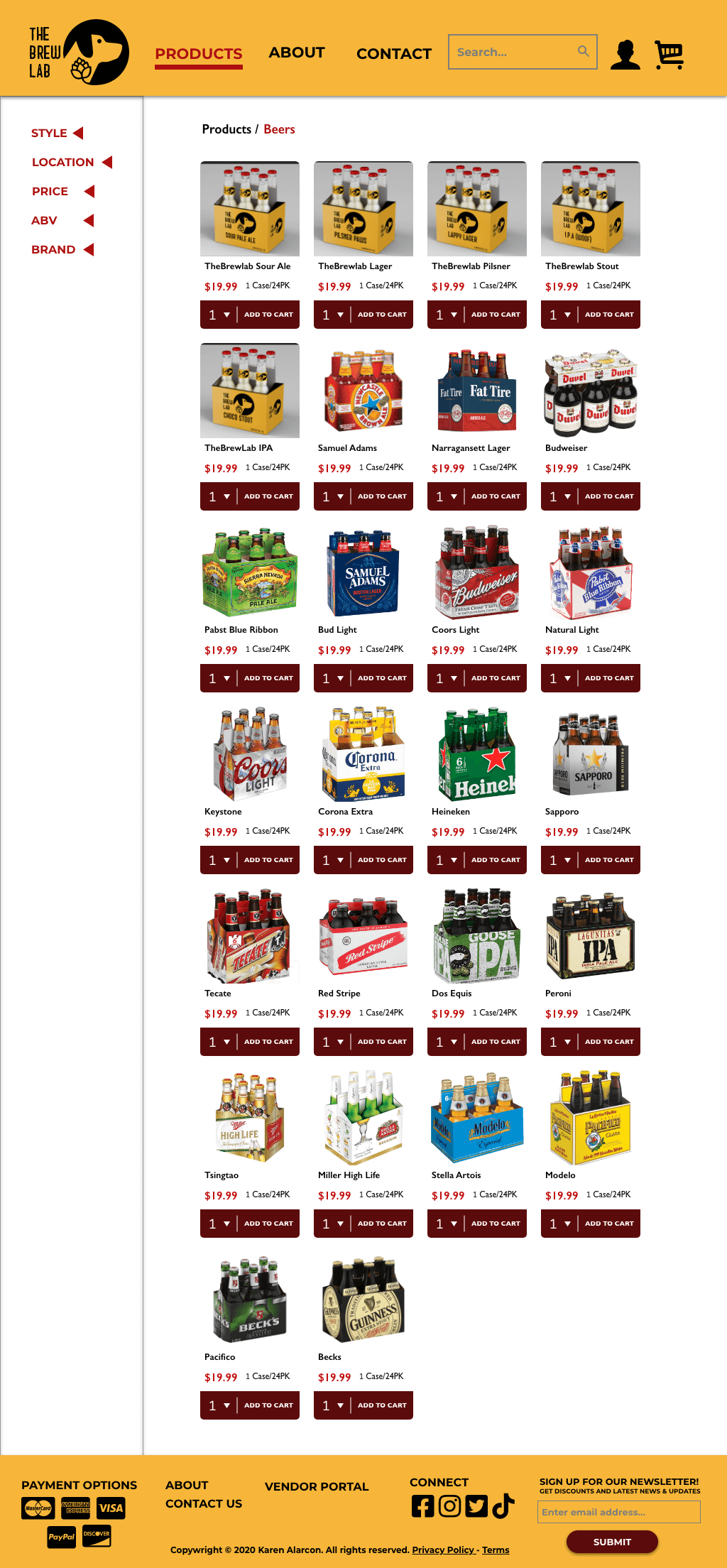
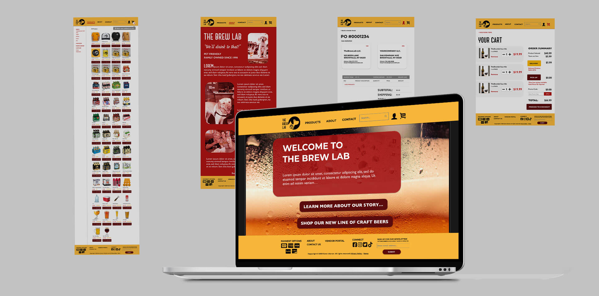
The Brew Lab Prototype Pages
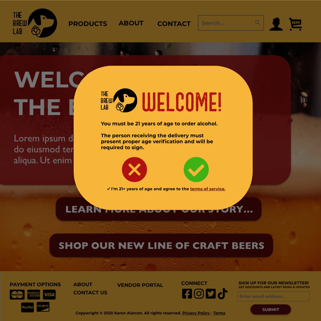
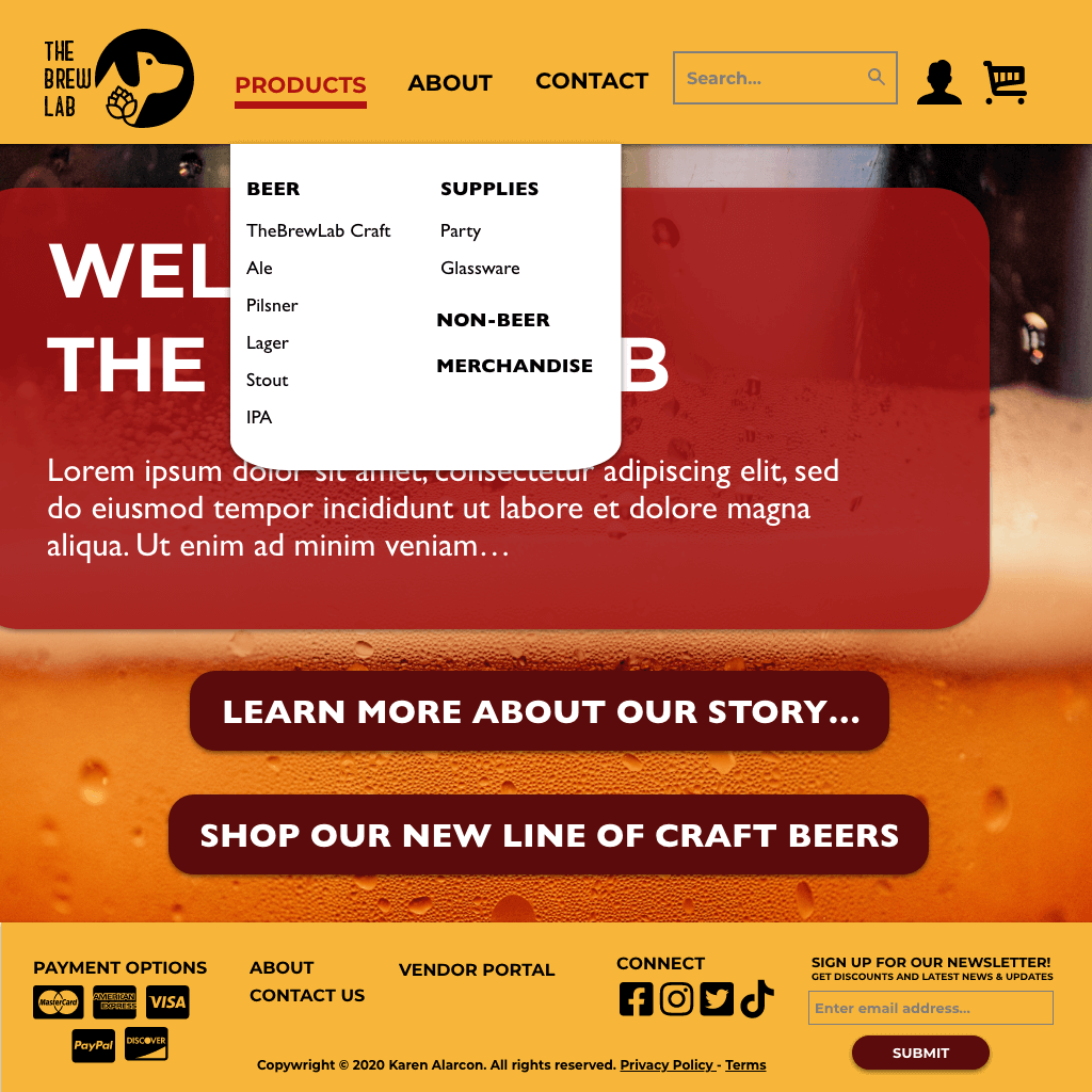
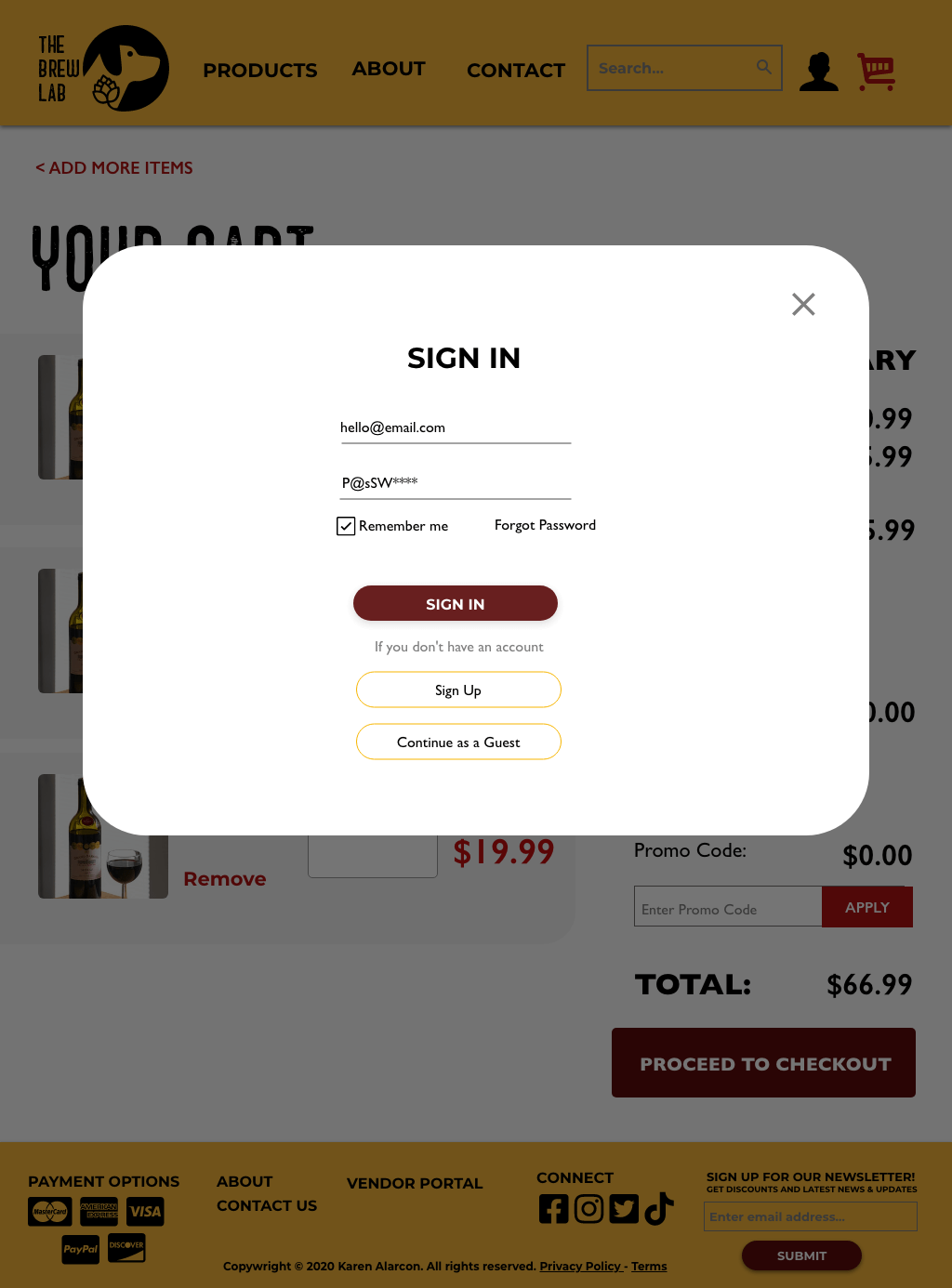
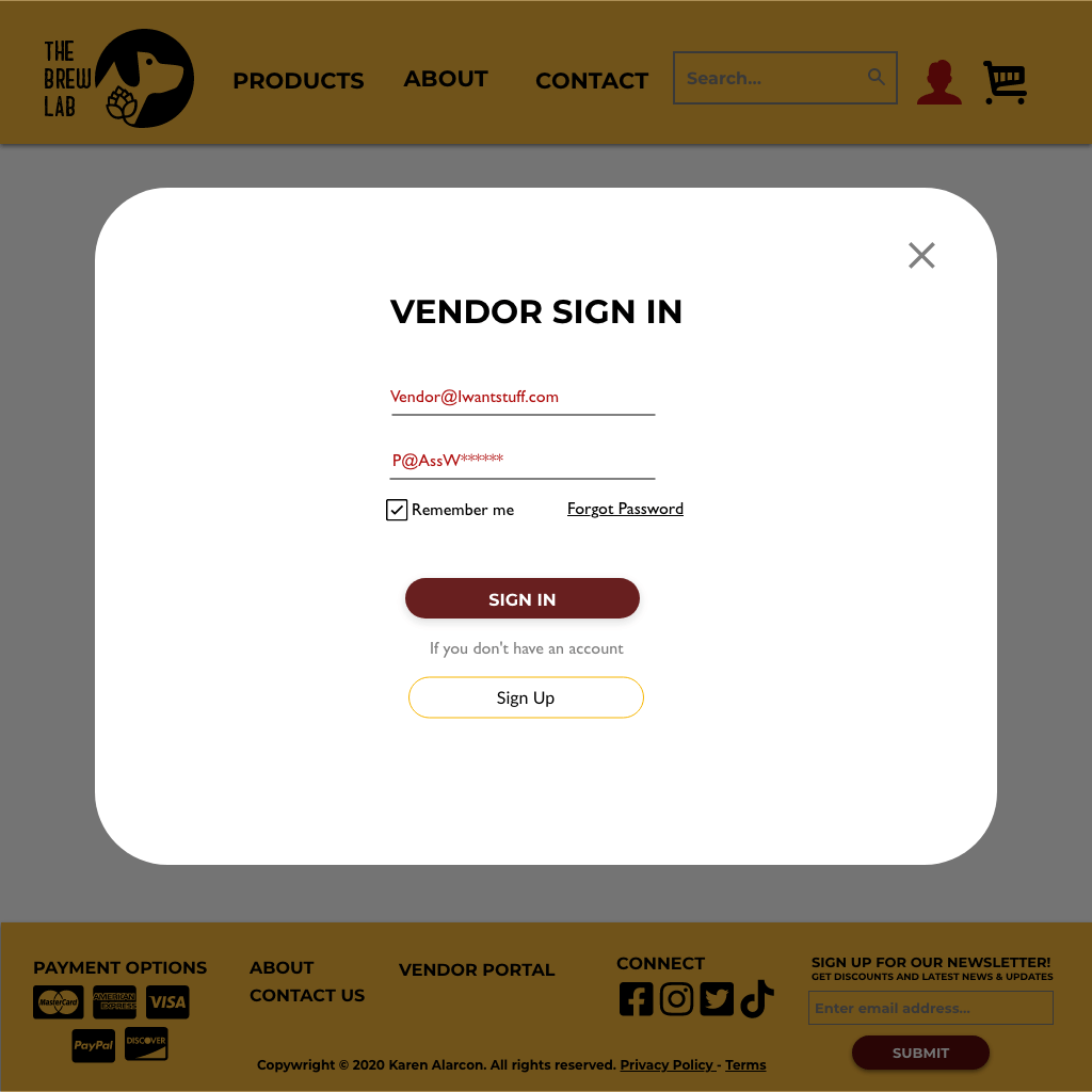
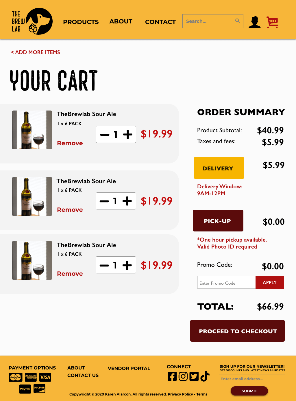
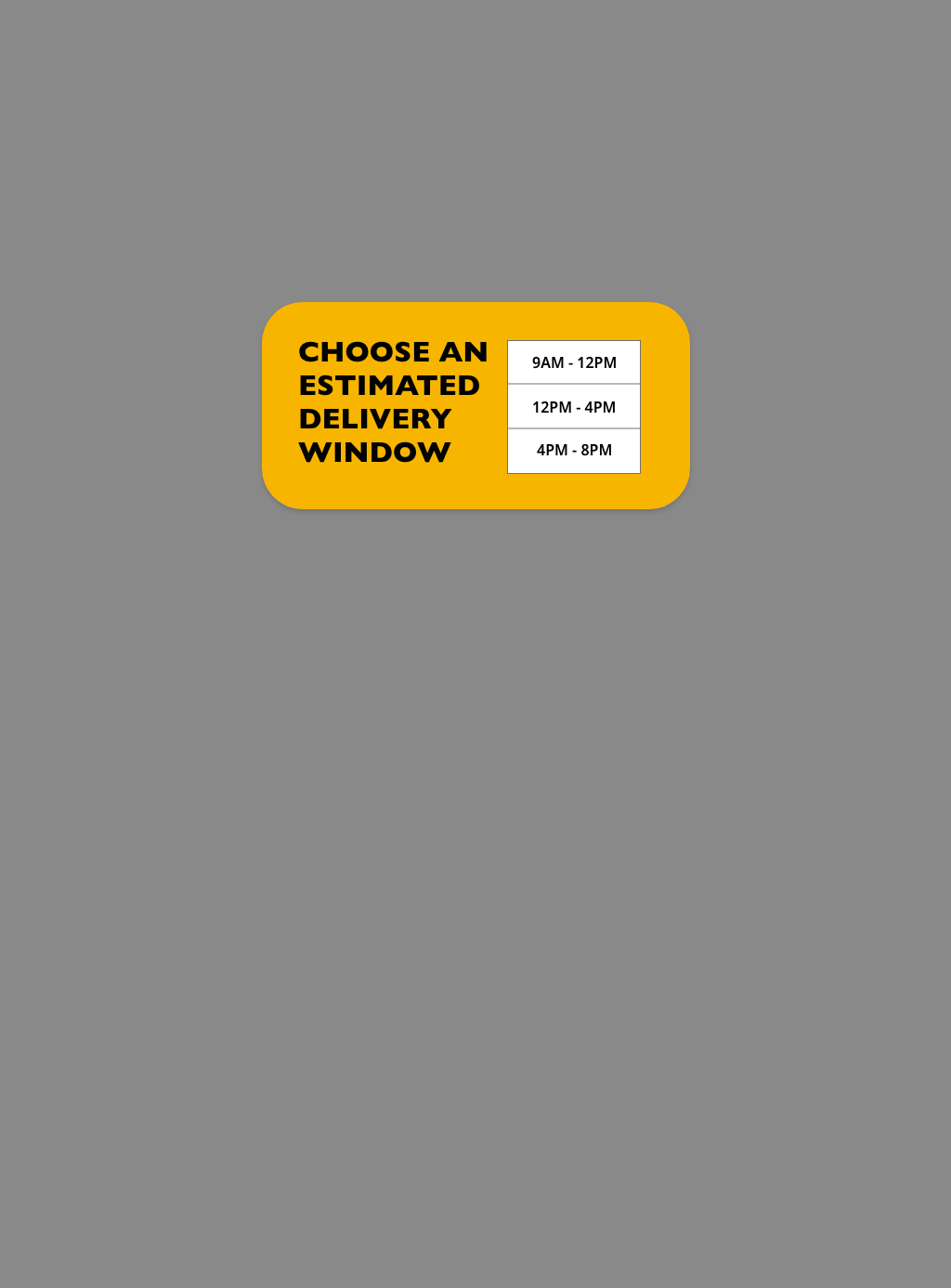
Below is a collection of some of the prototype pages. Click to enlarge.
NEXT STEPS
Oh, where does the time go?
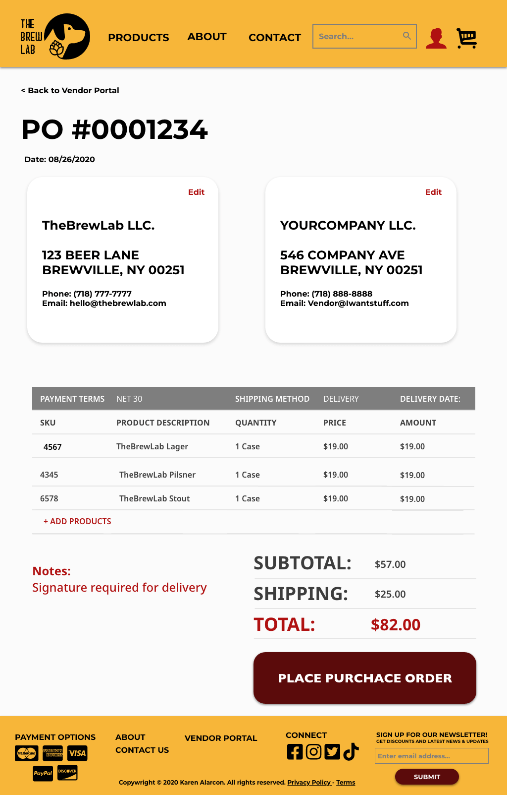
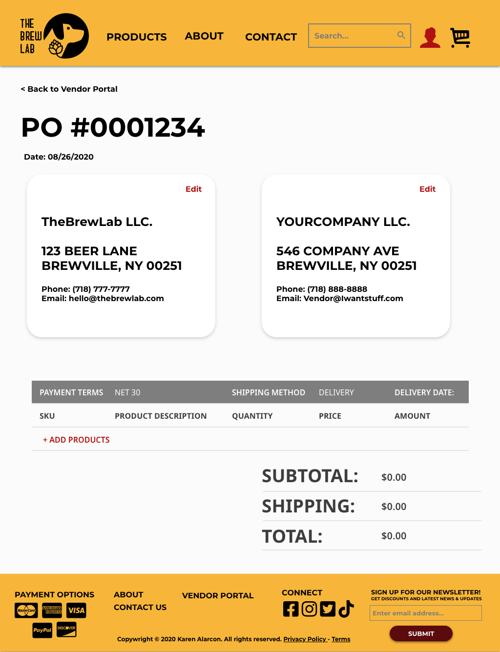
I had prototyped a user flow for Vendor Victor to place a purchase order but I did not get a chance to do a usability test. I loved working on this project and when I have more time I'd like to work on the following:
- Go back and do some user flows and wireframes
- Refine UI design further
- Recruit participants for a usability test for Vendor Victor's fastest path to place a purchase order
- Add the “All Products” link to the "Products" dropdown menu
- Build out the “View/Read/Write Reviews” user flow. Based on my research my users depend on recommendations to make informed decisions. Assumption being: some reviews are better than no reviews at all
- Do another round of usability testing for consumers
- Create a responsive version for tablet and phone
- Explore incorporating other features like a rewards system, brewery tour schedule...etc.
Glows
- I am so proud of what I could create in just 2 short weeks. This was my second prototype created in Adobe XD and being a long-time Adobe user really helped me out as well as the plethora of online sources
- I was excited to dive into research and try to understand the business as a whole and help it's 2 main customers
- I learned I love to organize information. Creating sitemaps and synthesizing data is my jam
Grows
- I wasted energy on making all filter options clickable in my prototype. My usability testing didn't even have my users test that option and so that was the time that could have been spent elsewhere
- I could have tested my prototype earlier if I had created a low-fidelity grayscale prototype instead of getting
caught up in design - Not all links look like links, would love to revisit my styling choices, polish and finalize the design
2021 UPDATE
When I completed this project back in Aug 2020 I was but a fledgling UX Designer. Revisiting this project with all the knowledge I have absorbed I am proud of where I was and where I am going. I will continue to update this project so be sure to check back to watch this puppy evolve.
More Works...
Client Case Study →
User Interaction | Visual Design | Web Mockup
Client Case Study →UX/UI Design | Heuristic Analysis | Web Prototype
UX Bootcamp Case Study →
UX Design | User Interaction | Android Prototype
Client Case Study →
UX Design | Info. Architect | Interaction Design
UX Bootcamp Case Study →
UX/UI Design | Product Design | Logo & Branding
© Karen Alarcon 2025 | hello@karenalarcon.com | linkedin.com/in/k-alarcon
