PROJECT OVERVIEW
My Role
UX Design Lead
Information Architect
Prototyper
Support to Research
and Usability Testing
Timeframe
3 weeks
October 2020
Team of 4
Tools Used
Adobe XD
Adobe Illustrator
Draw.io
Figma
Google Forms
Miro
Trello
Don't feel like reading?
Meet our client
FELOH
For Everyone's Love of Hair
(+ Beauty)
FELOH (pronounced "fellow") is a one-of-a-kind social marketplace for hair care and beauty. When you’re socially active on FELOH (posting content, making product reviews, etc.), you’ll earn cash to go towards beauty purchases in the FELOH marketplace.
The FELOH marketplace is the ultimate hub where beauty brands list their products to sell. You can also search the platform for the latest trends, styles, and products for all your hair and beauty needs.
The video above showcases the current FELOH application
What the client wanted
A UX “facelift” to the FELOH Marketplace as the client felt the platform looked rather antiquated. The hope was to have a sleek, new-age feel that would appeal to Millenials and Gen-Zers. The goal is to elevate the design to reflect FELOH’s creative and fun brand.
"We don't want FELOH to get lost in the sauce."
-Camille, Chief Visionary Officer/Founder at FELOH
What we delivered
In a team of 4, we delivered a design package that included a logo and icon redesign, a high-fidelity prototype Camille can take to her development team, recommendations for their navigational structure, as well as a research packet that shows our findings from our survey, task analysis, and usability testing.
RESEARCH
What makes FELOH unique is that it's both a social application and a shoppable marketplace. Because we only had 3 short weeks we focused our efforts on the mobile marketplace aspect of the application while another team focused on the social side.
To uncover customer habits and pain points our research lead sent out an initial survey that yielded 22 responses to uncover where people are currently buying hair & beauty products and what helps them confidently purchase those products.
Using that data we were able to pinpoint FELOH's direct and indirect competitors and this would also later help us to develop our persona who you will meet a little further down in this case study.

When a competitive and comparative analysis was done we saw that FELOH checks almost all the boxes when it comes to ideal features for a social marketplace app to have its mark in its respective field. However, due to its wide reach in both the social experience and the marketplace, FELOH’s comparative analysis shows room for improvement for marketplace-specific features, such as shipping options.
IN SHORT: FELOH has the features it needs but why weren't more people using the application?
In addition, a task analysis was conducted of 5 participants who had never heard of the FELOH application. We asked them to download the app, complete a task, and then asked some post-task questions that were then synthesized in an affinity map.

FELOH customers need:
- Security
- Simpler/Familiar navigation
- Clear rewards system
- Option to filer/sort/search products
- Easier Checkout process
- Relevant reviews
- Clear product categories & labels
- More details to inform purchases
Meet Michaela
Thanks to our research, we were able to develop our persona Michaela who represents our FELOH users. We wanted to be sure to keep her in mind throughout our entire UX process.

Michaela needs
A navigable and secure way to shop in the marketplace that encourages her to view, share, and confidently purchase beauty products.
Our solution
To create an easily navigable and secure marketplace where the user can intuitively discover their desired product(s) and have an understanding of the reward system to encourage further engagement on FELOH.
We believe that this will enable users to have a sense of confidence, findability, and security throughout their experience in the FELOH Marketplace application.
DESIGN
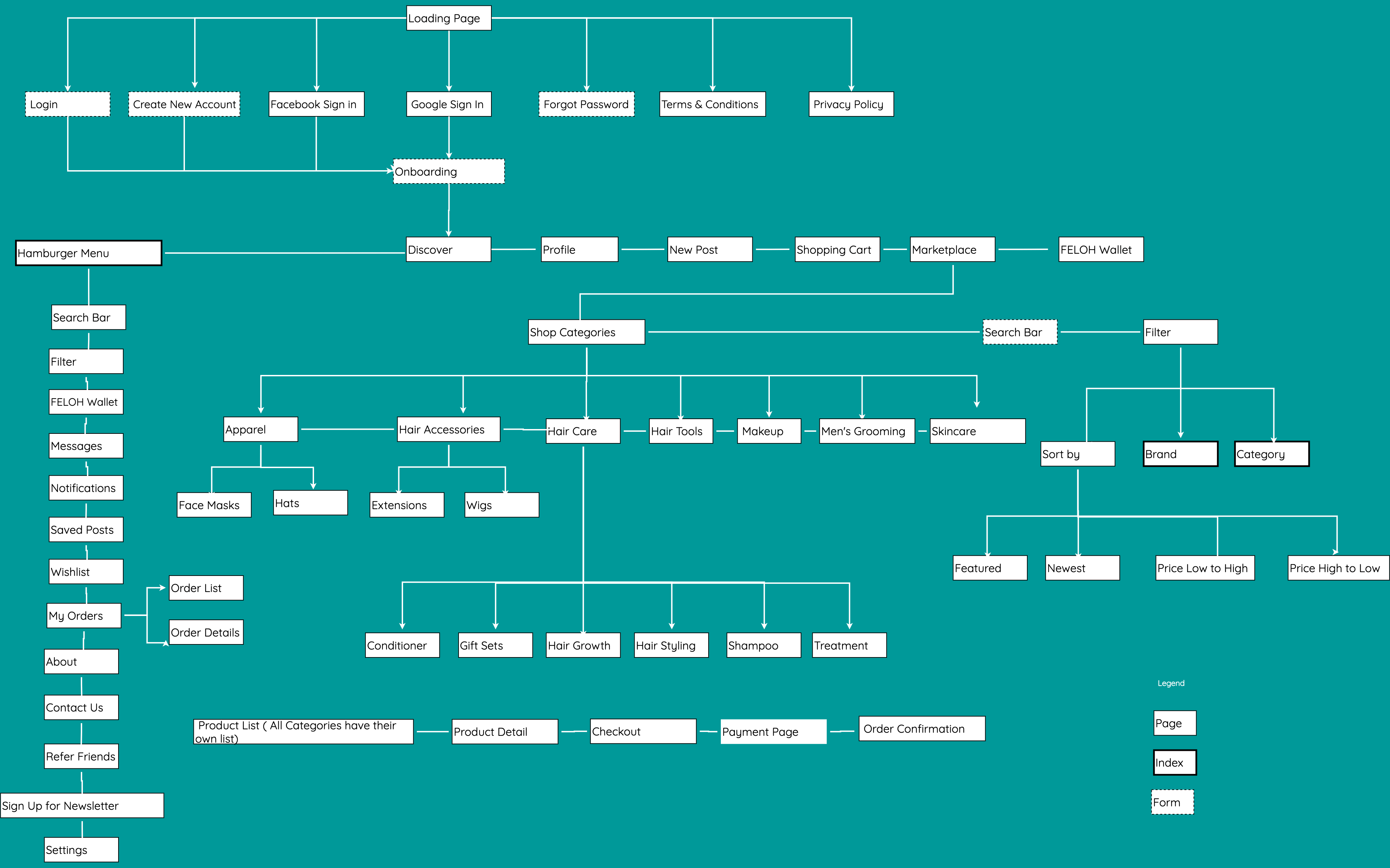
Reimagining the FELOH navigation
Working with Camille and the social team I wanted us to pinpoint what are the most important things our FELOH users immediately needed to access. I didn't just want to create a navigation that worked only for the marketplace but global navigation that would be present all throughout the app no matter if you were on the social or marketplace side of FELOH.

Current FELOH Navigation

New proposed global FELOH navigation wireframe
Understanding current FELOH product categories
Our task analysis revealed users became frustrated while trying to find something as simple as shampoo. Besides the lack of a search bar, my assumption was how products were categorized on FELOH might be the culprit.
- FELOH currently had only 9 Product Categories with no Search, Subcategories, or Filter options
- When you clicked into Products not all of FELOH's products populated on this page
- Some items in Men's Grooming could also live in another category to increase findability

Current Product Category Dropdown Menu
Where will these products go?
Wanting to test the assumption and understand how our users would categorize FELOH products I lead an Open Card Sort with 5 participants with 185 current FELOH products

Key takeaways:
- Rename the main Product categories so it more aligned with clients
- Introduce subcategories so clients can pinpoint their products needs
- Introduce sort options ex. by Brand
FELOH User Flow
Purchasing a Product
Wanting to understand where we could eliminate redundancies, view pain points and alternative paths I put myself in Michaela's shoes and outlined the user flow for FELOH customers to purchase a product.
Please use the orange slider to see FELOH's current user flow (left) and my proposed future state user flow (right)
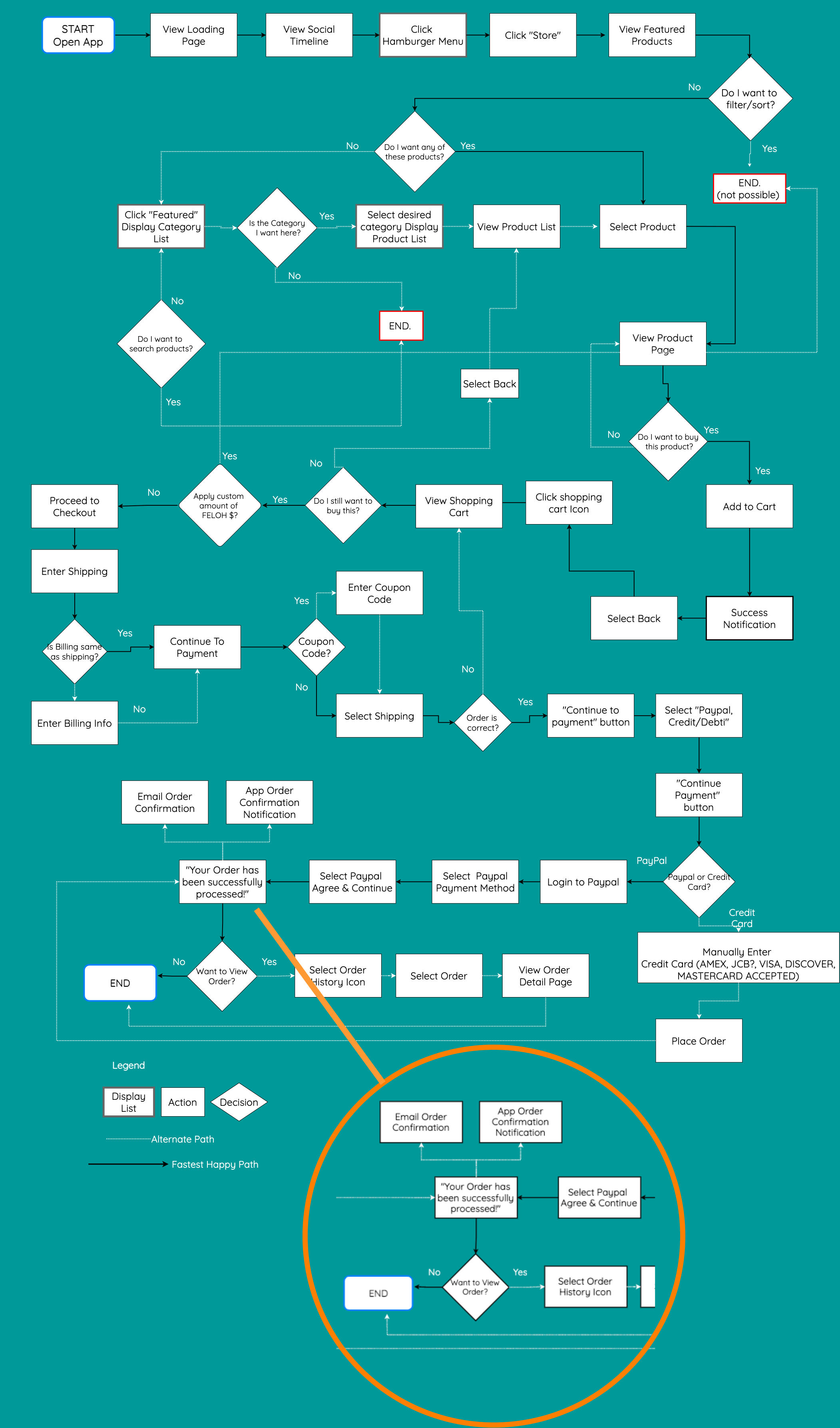
Key takeaways:
- Navigating through the FELOH app I accidentally ended up purchasing a bottle of shampoo because there was no order review page after I entered my Paypal information. Don't worry, the product I got ended up being fantastic but this initially created a small sense of panic that I would never want any customer to feel.
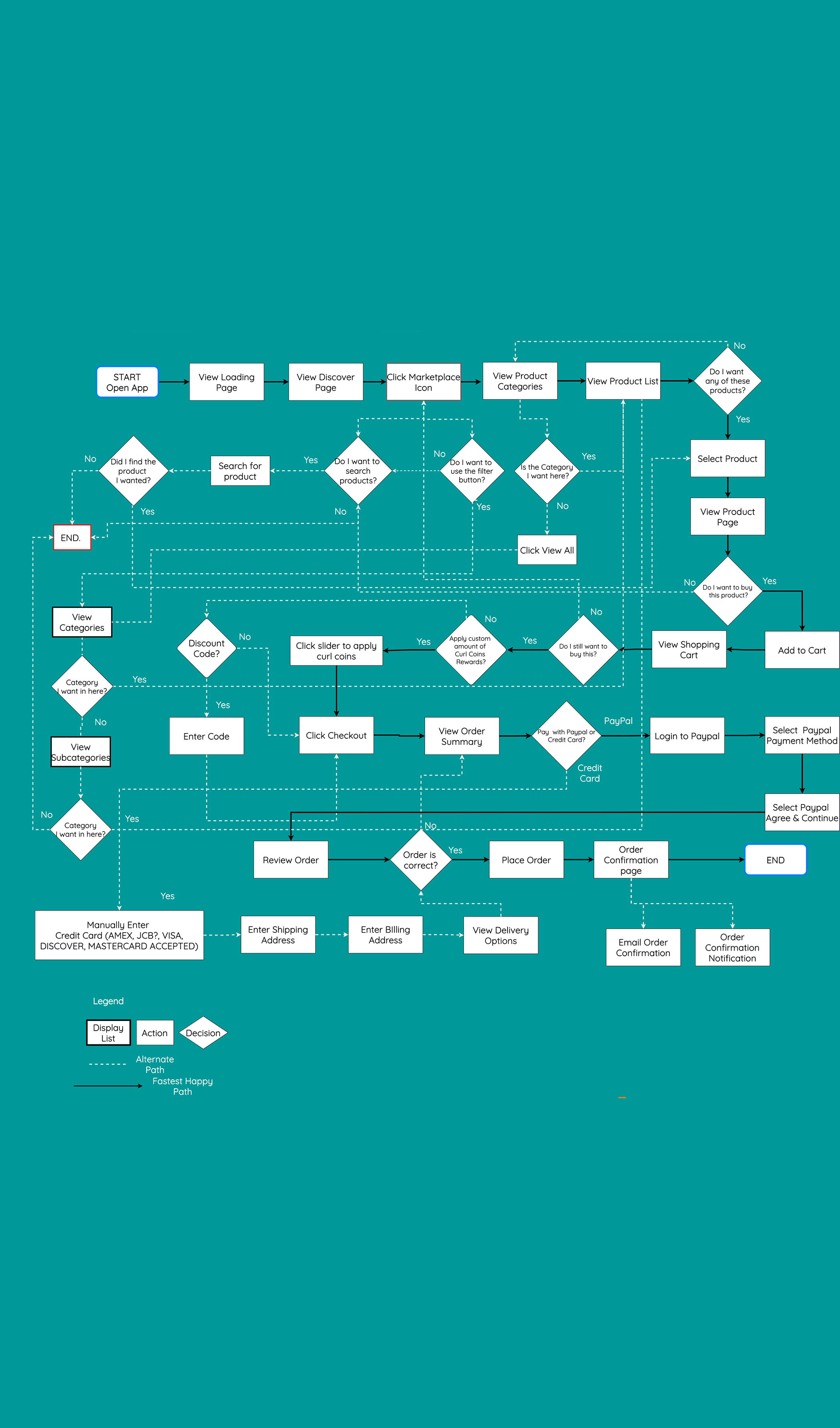
FELOH Sitemaps
The open card sort gave some insight on certain product subcategories people wanted and our task analysis showed us people wanted certain options like "search" and "filter".
I then felt confident enough to map out the current (left) and a proposed (right) sitemap for the FELOH Marketplace. Adding in those extra features definitely made it more robust but I think will ultimately help FELOH to cater to those clients that love to discover products on their own vs those who immediately go for the search bar.
Please use the orange slider to see the current (left) vs proposed (right) sitemap

Redefining the FELOH rewards system
One of FELOH's greatest and most enticing features was its reward system. Where anytime you write a post, upload an image/video, or shop in the marketplace you get "FELOH dollars" to then spend for future purchases in the marketplace. Currently, it wasn't highlighted or even properly understood by FELOH users.
"I was told I received $10.00 in FELOH $, but beneath that, it said it equaled $1.00. Then, when I went to checkout, it said it equaled $0.10. I found this to be misleading and unclear"
-Frustrated FELOH user

FELOH's current reward page is vague and does not explain how to get more FELOH dollars.

Can only see rewards applied after you've completed Step 1-5 of the checkout process.
Asking for clarification
When we asked our client how they envision the reward system to work they expressed instead of FELOH Dollars it would now be called Curl Coins™ and we were given a breakdown on how the new reward system. They also expressed interest in creating a special icon just for the rewards.
Current FELOH brand colors & logo
FELOH had an existing color palette and logo that we worked with to create our initial designs.
In our task analysis, 3 out of 5 participants called out a problem with the FELOH logo describing it as: confusing, hard to read and, not reflective of FELOH's brand and mission.


CURL COIN™ ICON
With the reward system defined I designed an icon that was familiar yet fun and would hopefully entice users to select it to learn more.

NEW FELOH LOGO
I wanted to design a logo that was readable but still representative of FELOH's fun brand while also paying homage to their current logo
Design studio sessions
I led various design studio sessions with 2 other UX designers. We explored various aspects of the layout. Consulted with the client, social team and grabbing inspiration from established brands.

Usability Testing our minimum viable product
Key takeaways:
- Our testers said the design looked professional but not for the intended modern younger audience "Kind of looks like a school app..."
- Break up check-out process "The checkout process is like a CVS receipt..."
- Confusion on if the shopping bag icon translated to "Marketplace"
- Allow search in next prototype iteration "Convenience is key!"
Creating the FELOH Marketplace style guide
Now that we had input from our users and Camille we focused on creating a more updated design and style guide for our next usability test.

Navigation bar design iterations
The navigation bar went through a few iterations before we landed on our current version. We explored removing the gradient and using just one color to not distract users from FELOH content but to also give a more clean look.


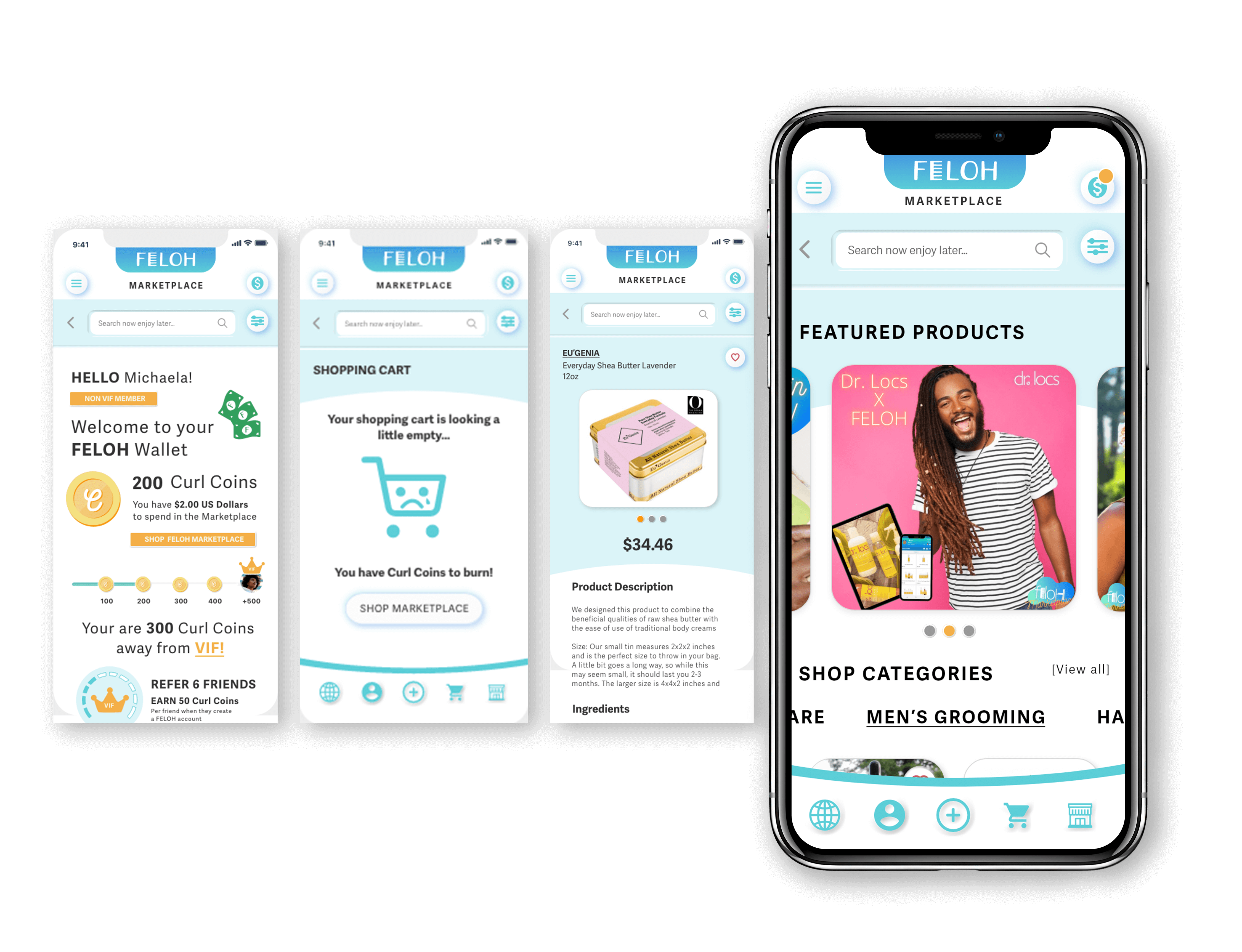
FELOH Landing page design iterations
In our first prototype (left) users were not seeing products right away. Instead, they would first have to select a category to then see products. In our updated version because we allow you to horizontal scroll on the categories we are able to showcase products you can now vertically scroll. If you clicked the category name it would take you to all the products in that category.

(LEFT) 1st prototype (RIGHT) Current prototype
Latest prototype usability test
We tested our current version against 3 participants and asked them to complete the tasks below.
Scenario:
You heard about two new brands that are really worth trying out that are only available on the FELOH marketplace. You’re also curious about the Curl Coins reward system and what it means to be a V.I.F member.
Tasks:
- Familiarize yourself with the Curl Coins reward system and the advantages of being a V.I.F member
- Add to your cart Zac Von Sleek’s “His” Shampoo and the Eugenia Body Shea Butter Lavender and complete the checkout process
- Assume that some time has passed since you received your product-- please leave a review for the Zac Von Sleek "His" Shampoo
On a scale of 1-10 (1 not secure, 10 being very secure) how secure do you feel using this app?
User 1: "8, No issues with security at all. Seemed like a legit checkout process. Liked that I could use PayPal."
User 2: "8! I like the colors, they were really fun "
User 3: "Solid 9 lol it looks like a real app"
Want to test our current prototype?
NEXT STEPS
A new FELOH is here!
Since we've completed this project we were excited to learn FELOH was the recipient of some investment capital from 3rd place prize in the Velocity Creative Accelerator and came in 1st place at the Black Girl Ventures Pitch Competition.
Version 2.0 of FELOH is out now! We feel so proud to be able to contribute in a way to elevating the user experience of this new version. Even if our designs may not make it to the final version we know we gave the client a lot to consider and it is reflected in this new version.
What I learned
- Learn to delegate tasks better instead of trying to take on more work for yourself
- You can't please every single user and that's okay
- Don't try to change too much too fast, you won't be able to accurately test if you change too many things at once

More Works...
Client Case Study →
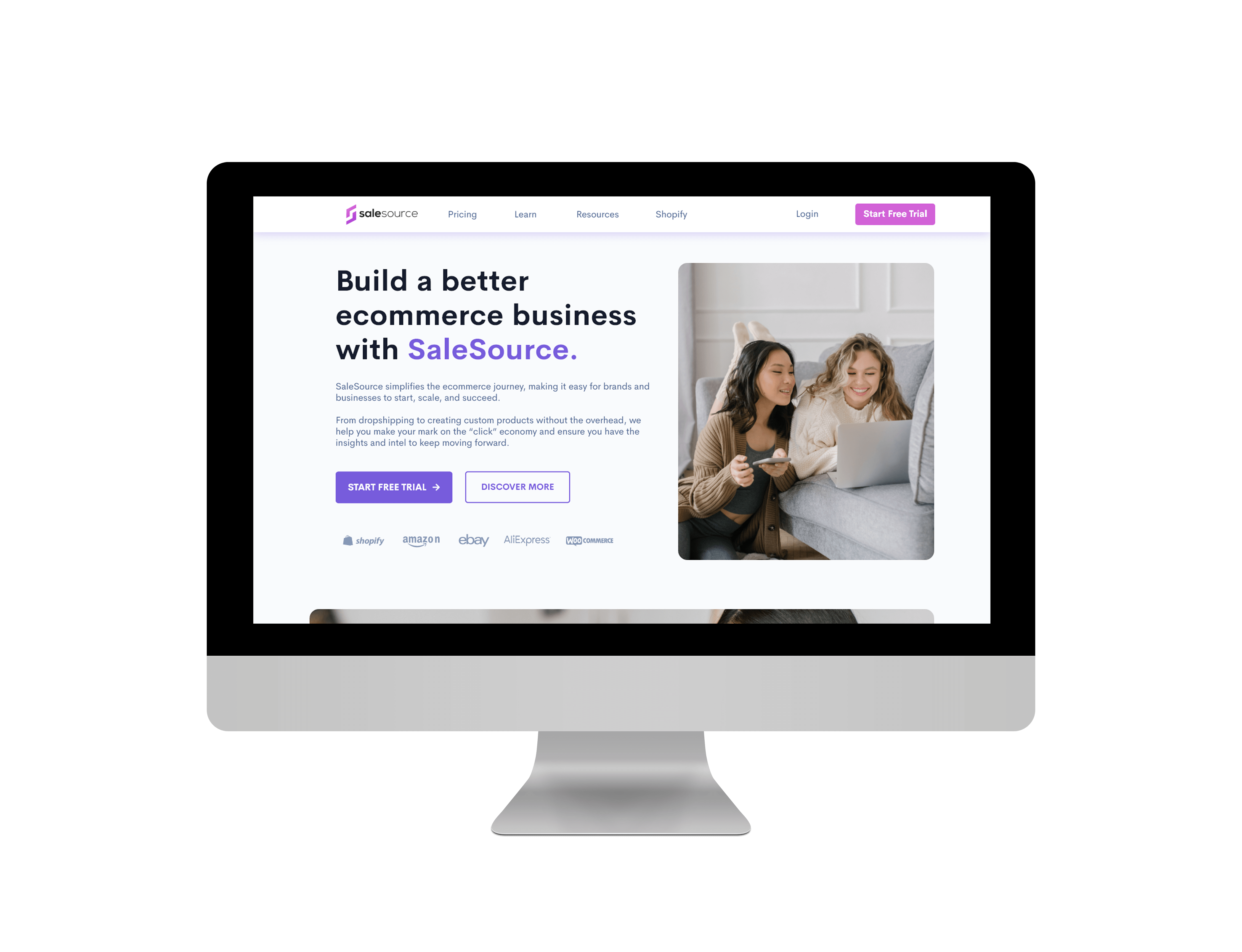
User Interaction | Visual Design | Web Mockup
Client Case Study →UX/UI Design | Heuristic Analysis | Web Prototype
UX Bootcamp Case Study →
UX Design | User Interaction | Android Prototype
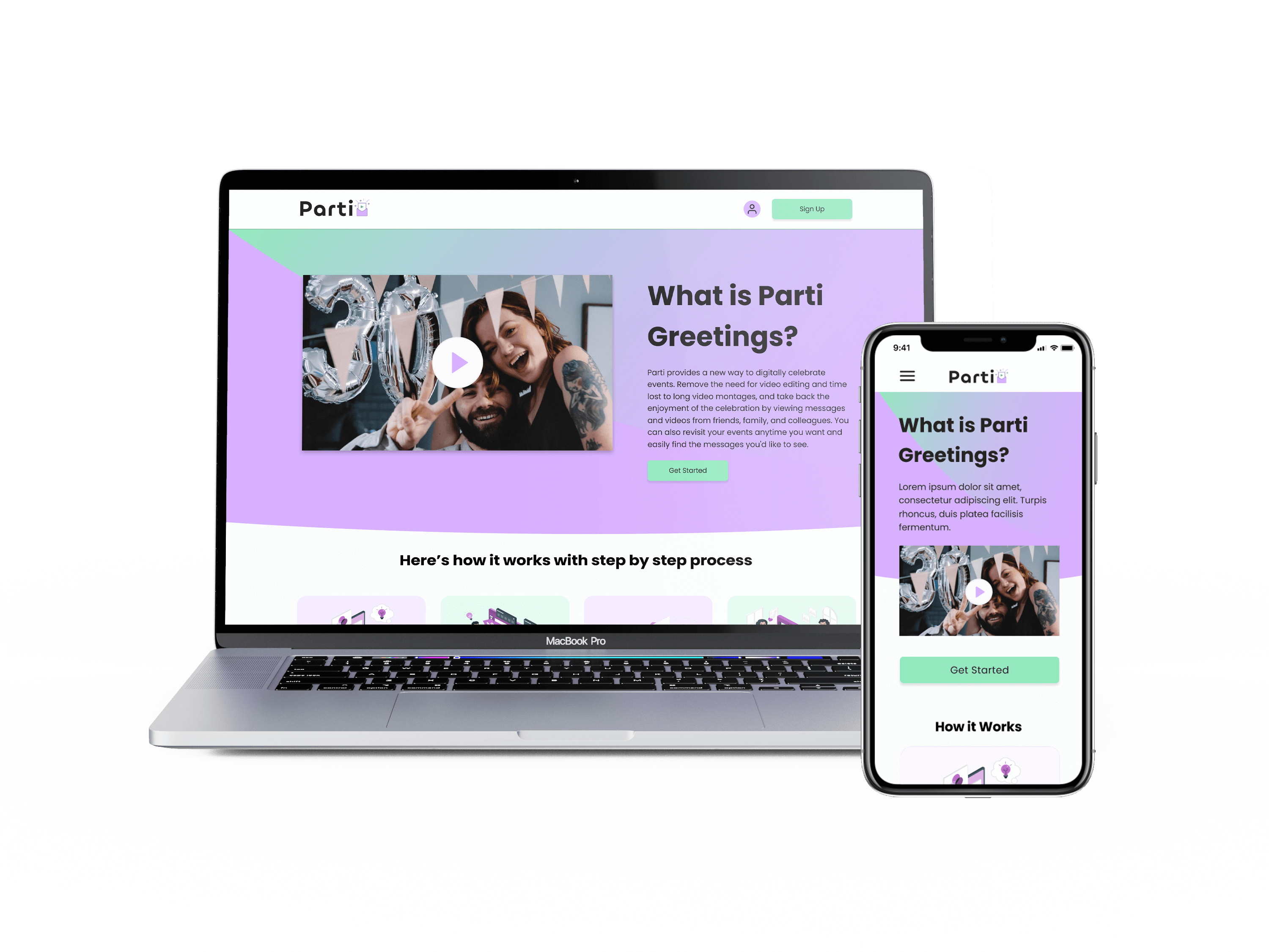
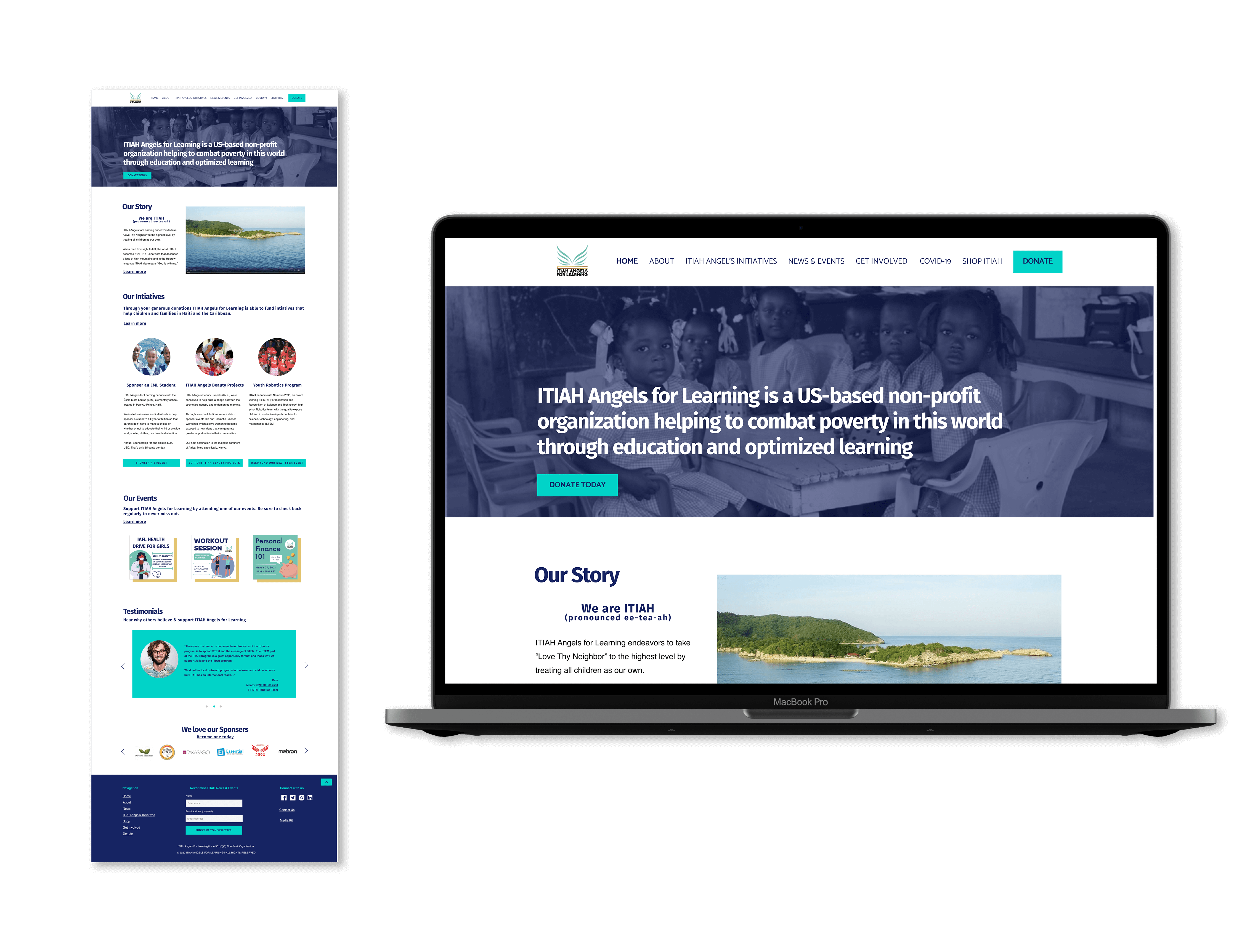
Client Case Study →
UX Design | Info. Architect | Interaction Design
UX Bootcamp Case Study →
UX/UI Design | Product Design | Logo & Branding
© Karen Alarcon 2025 | hello@karenalarcon.com | linkedin.com/in/k-alarcon