
Project Overview
My Role
Lead UX Designer
Prototyper
Heuristic Analysis
Timeframe
6 Weeks
April - May 2021
Fully Remote Team
2 Project Managers
3 UX Researchers
2 Other UX Designers
Volunteer Project for UX Rescue
Tools Used
Figma
Adobe Photoshop
Notion
Slack
Google Suite
Don't feel like reading?
( But you might need the context ;D )
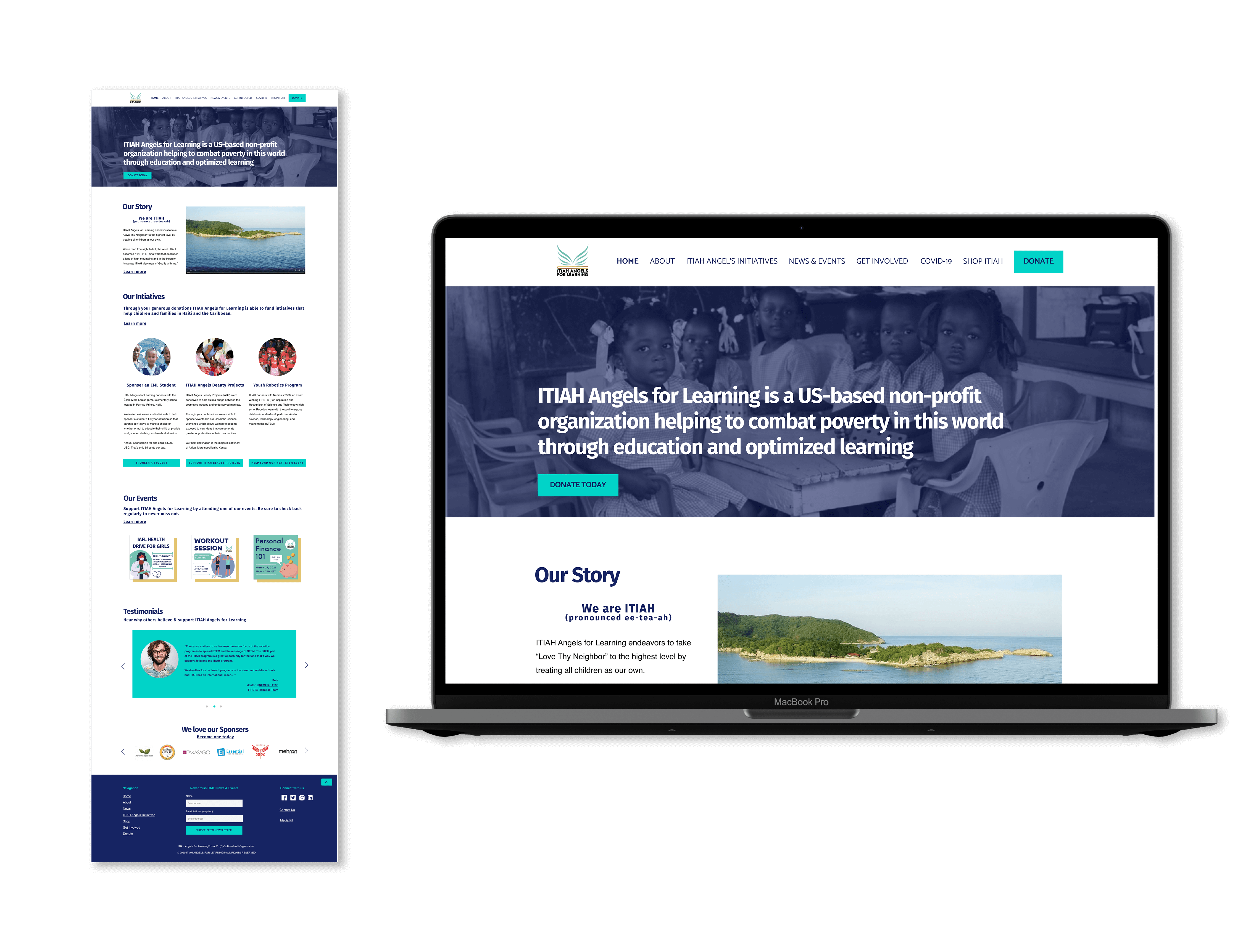
The Client
ITIAH Angels for Learning (pronounced ee-tea-ah) is a non-profit organization founded in 2019 who through donations is able to fund different initiatives that help combat poverty by educating children and inspiring adults in Haiti and parts of the Caribbean.
What the Client wanted
- Optimize the donation process so it can be the central hub of where donations are recieved
- Recommendations on content strategy
- Help with understanding the UX process it's benefit to their organization
The Strategy
- Research direct non-profit competitors on how their donation flows work
- Define the usability issues on the current ITIAH Angels for Learning website and identify ways to resolve them
- Design Lo-fidelity prototypes of the current and proposed donation process and conduct a usability test against users
- Iterate design and present results and recommendations
Research
Non-profits pay big $$$ for their donation integrations
I (shamefully) don't donate enough and so I needed to understand how donations work with more seasoned non-profits. Picking 5 non-profits with a similar mission I noticed 1 key thing:
100%
of competitors were using a paid donation/fundraising software plan

Images from givebutter.com
Those nice branded donation pages are an expensive investment as each software takes a percentage in addition to any payment fees you might encounter.
ITIAH being a newer non-profit wanted a feasible low-cost solution.
If you'd like to see this competitive analysis please click here
Heuristic Analysis of ITIAH: It's a group effort
As the research team was analyzing ITIAH's Google Analytics I had each of my UX design team members (including myself) conduct a heuristic analysis of ITIAH's current site. We chose Jackob Neilson's 10 Heauristic Principles to test against then came together to share our findings that coupled with our competitive analysis and we idenfitied ITIAH's top violations and brainstormed possible solutions.
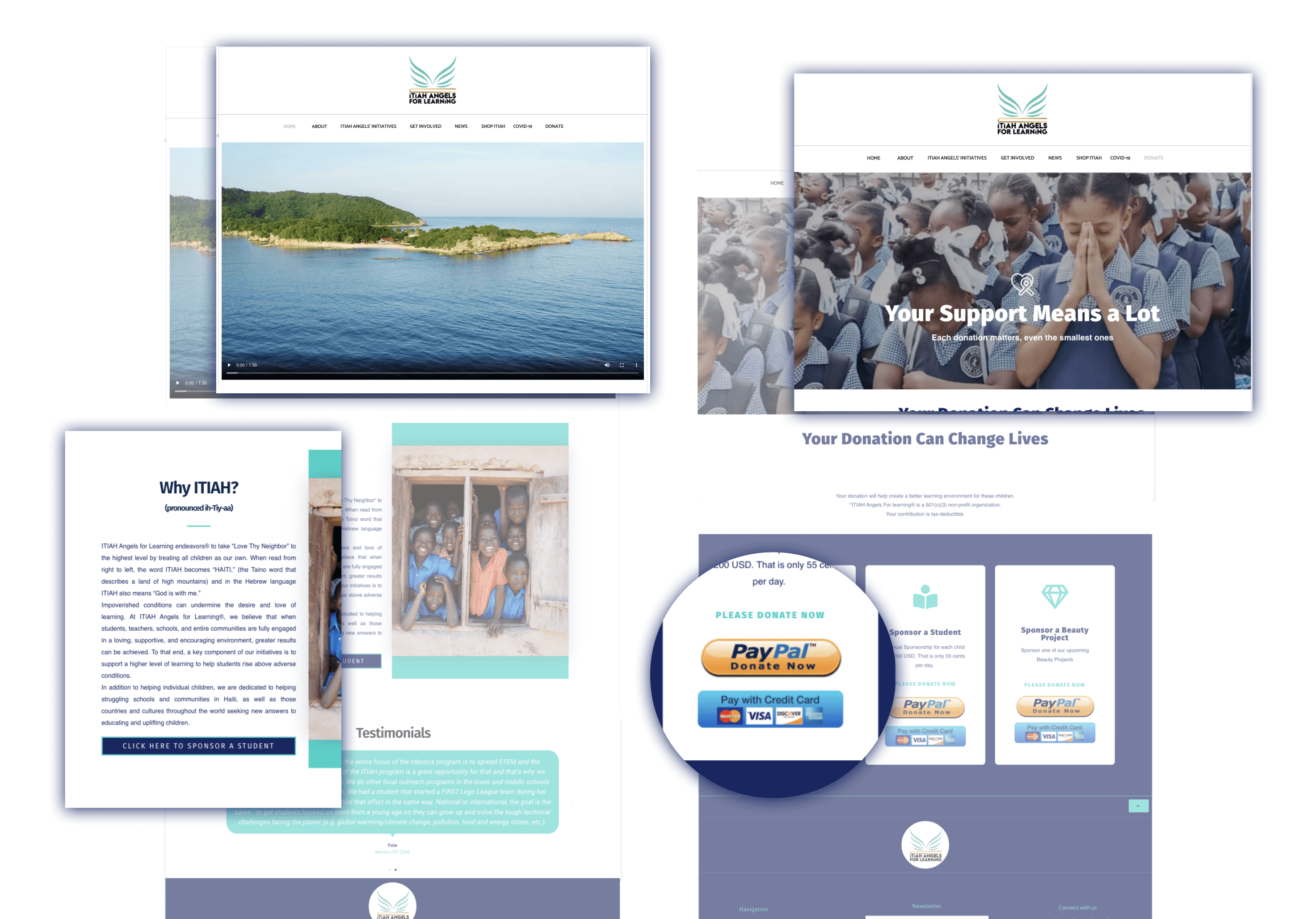
Aesthetic and Minimalist Design
- Homepage and Donation pages have giant hero image or videos that take up valuable real estate
- Donation page has redundant, dated donate payment buttons
- There are large blocks of text that can be broken up for readability
Consistency and Standards
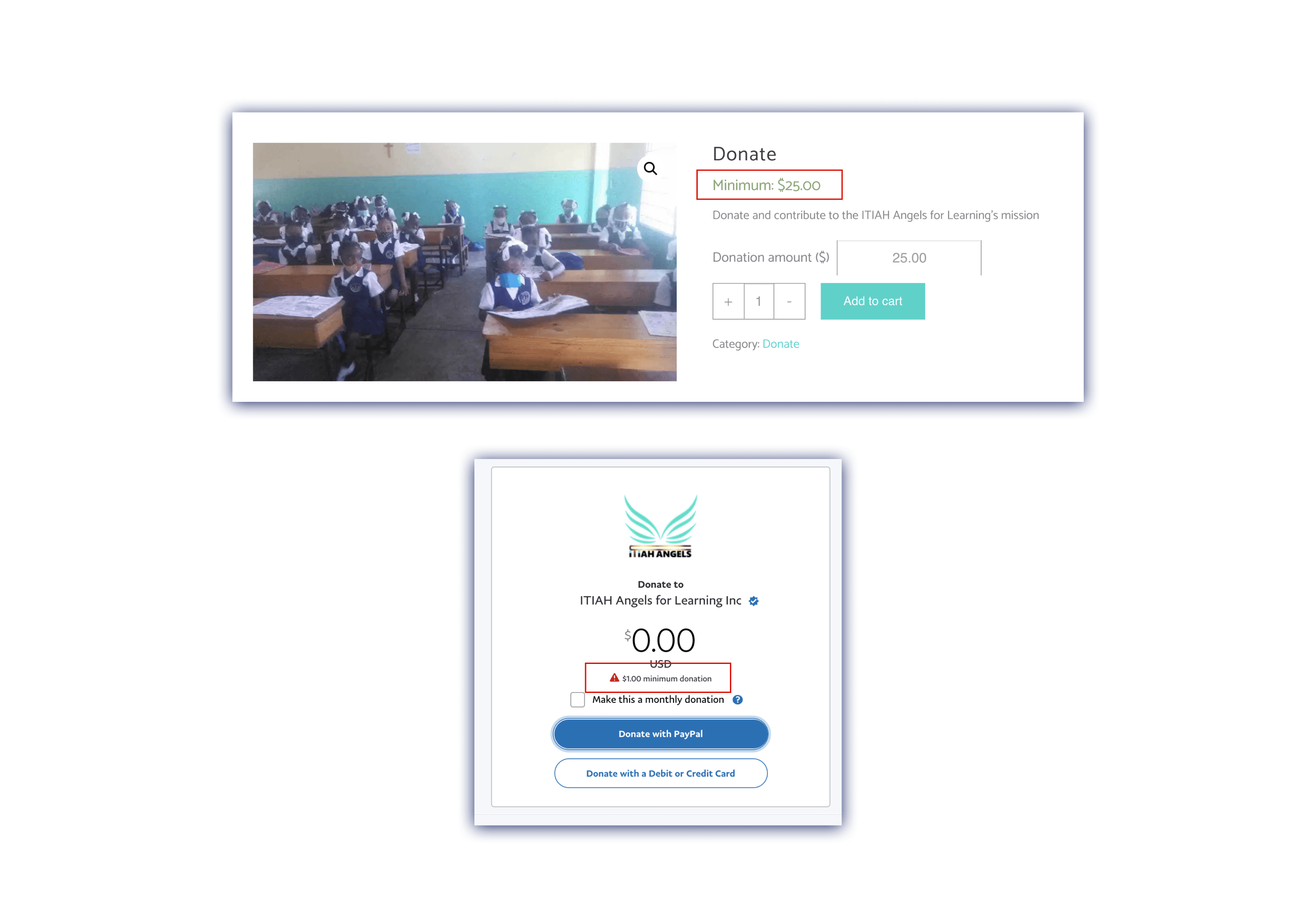
- Inconsistency between minimum donation amounts in Credit Card vs PayPal flows
- Homepage and Donation page need to outline the impact of donations
Flexibility and Efficiency of Use
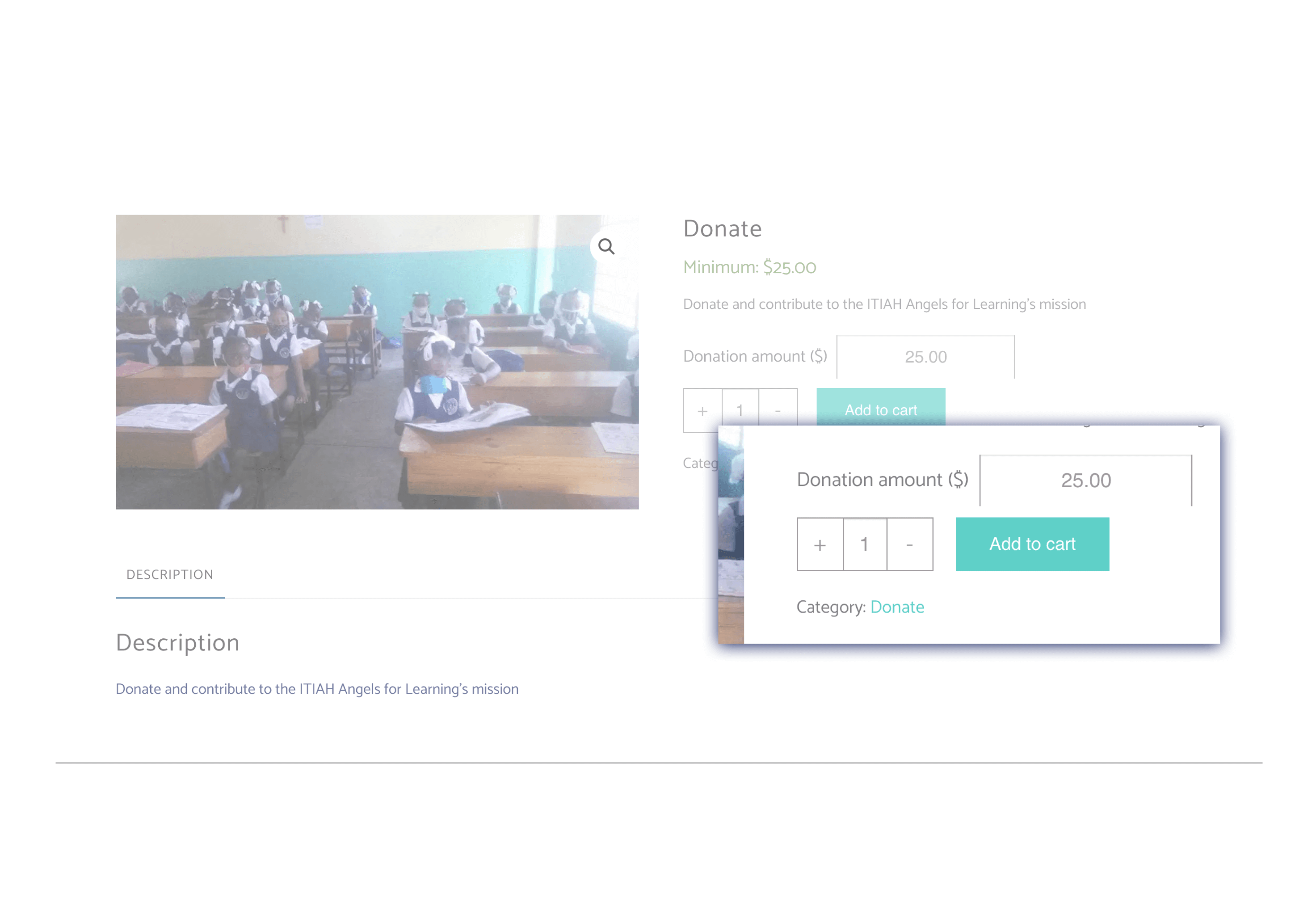
- Donors shouldn't have to "Add to Cart" donations
- Donors should have suggested donation amounts and option to enter their own
- Donors need to return to be homepage easily from the donation page
Design
Working with ITIAH brand colors & typography
ITIAH already had an established brand in place. I gathered the current color palette and tested it for accessibility. ITIAH's target demographic is aged 35+ and so I wanted to be sure to highlight the color combinations that would be accessible to all.

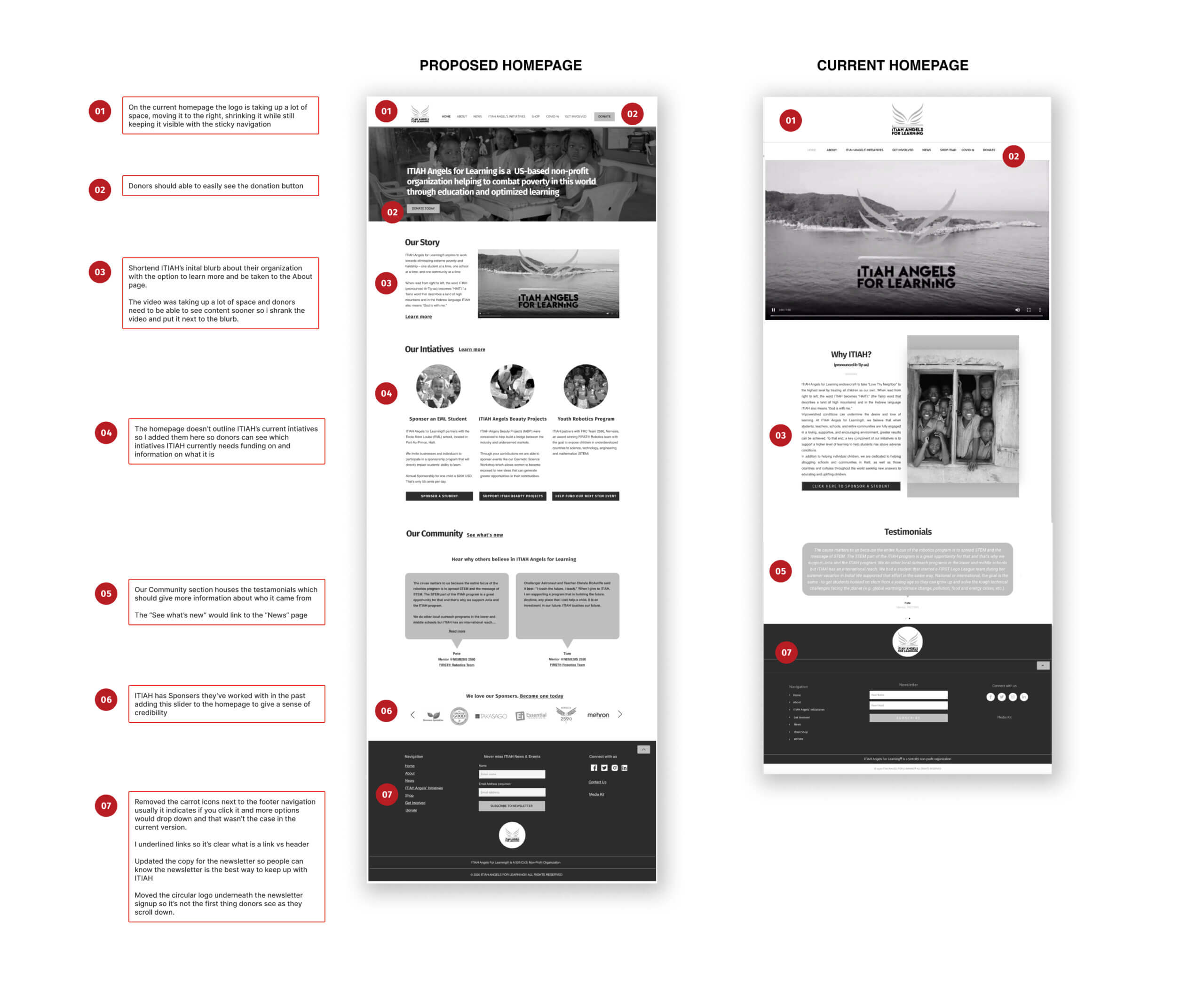
Homepage Redesign
The research team shared with us their findings from Google Analytics
Out of 63% of people that viewed the ITIAH Homepage less than 10% go on to view another page on the current website.
This indicates that the current homepage could also be the culprit for why ITIAH wasn't getting donations from their website. I proposed a solution that brings in information from other pages to create a more informative, credible homepage with clear donation buttons.
Let’s A/B Test to eliminate those assumptions!
We've assumed a lot about our potential donors up till this point, now let's see what they actually thought.
Our research team was able to rangle 5 usability participants. I chose to test a grayscale lo-fi prototype of our proposed solution because I wanted the usability participants to focus on the content and not be distracted by color.
To eliminate bias we also made a grayscale prototype of the current website so each participant would get to test both the current and proposed solution in the same fidelity and not know which is the current version.
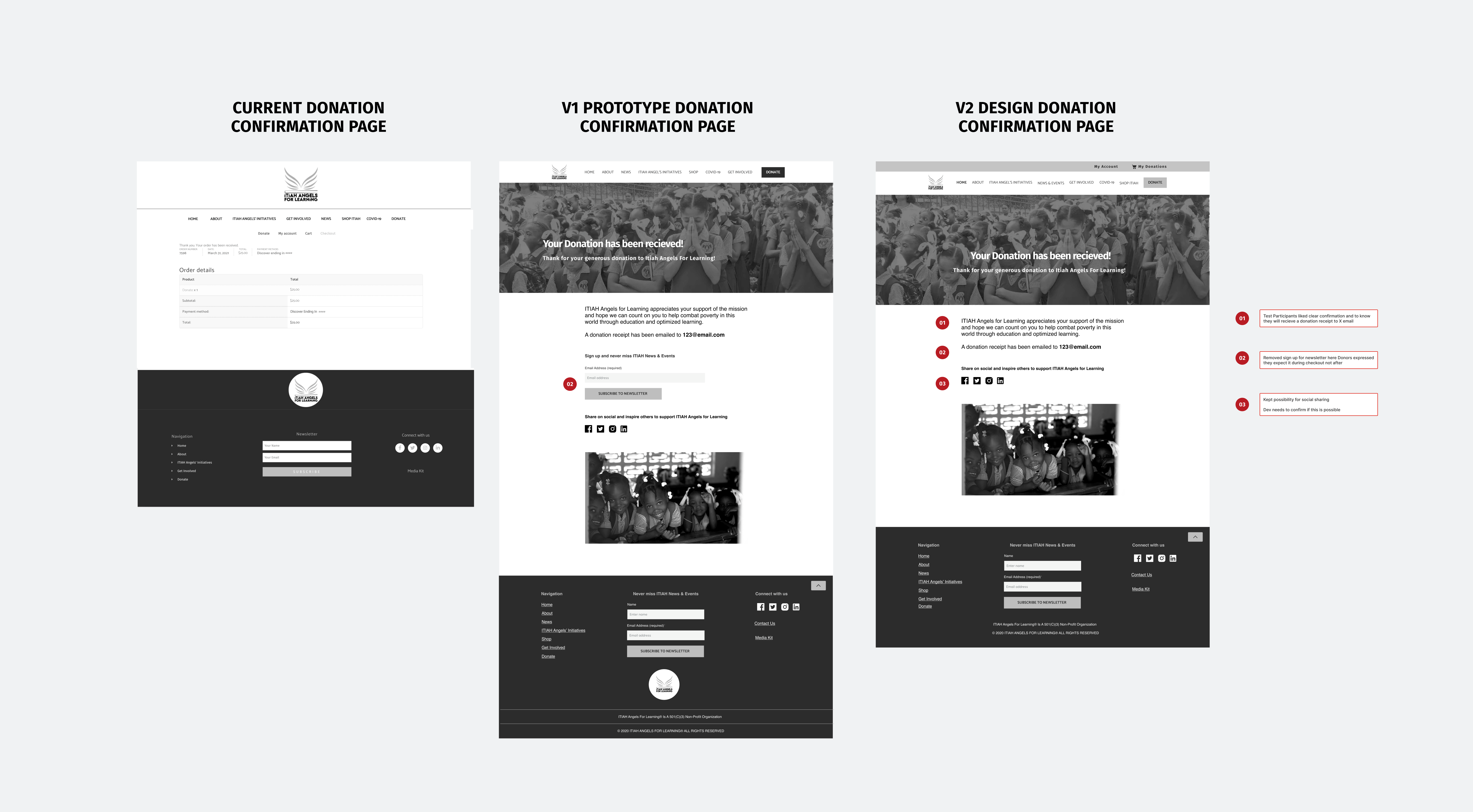
Key Findings from A/B testing

Current Donation flow:
- Donors liked being able to choose where their donation could directly go towards on the donation page
- 40% (2 out 5) Donors Strongly Agreed this donation process was easy to use while the other 40% Somewhat Agreed and the last participant felt neutral
- Donors didn't like that the transactional terms in the current donation flow such as "Coupon" and "Product" made them question the credibility and security of the site
- Donors didn't like the lack of information if they would receive an email confirmation once they donated via credit card

Proposed Donation flow:
- Donors liked seeing clear, multiple Donate buttons and found the size of the media on this homepage less distracting
- 80% (4 out of 5) of Donors Strongly Agreed this donation process was easy to use while the remaining participant Strongly Disagreed (can't win 'em all)
- Donors didn't like that it was still unclear where their donations would go towards even with the blurb to the right of the pre selected donation amounts
- Donors didn't like the "Our Community" copy on the homepage. They found it misleading and unclear
In short, for our next design iteration we needed to:
- Remove transaction-centered language
- Highlight the specific impacts of donation amounts
- Show all initiatives in one place
- Clear up confusion on the Homepage
Since usability participants rated the current site as easy to use as the proposed solution it indicated that ITIAH's current solution just needed to be improved upon and they do not need to invest in expensive donation software.
Next Steps
What did ITIAH say?
When we presented our solutions and findings to the ITIAH Angels for Learning team they appreciated our efforts and found our solution insightful and feasible. They also appreciated the thorough and clear direction on what can be done to improve in their donation process. If implemented we will know it to be successful when we see an increased donation rate and fewer drop-offs on donation page.
Phase 2 recommendations:
- Wireframe & Design other pages: About, Initiatives, Get Involved, News & Events
- Simplify their content while maintaining their tone and impact
- Another round of card sorting or tree testing
- Create a mid-fidelity prototype to test with ITIAH's target demographic
Grows
- I wish I had checked in more with our PM and Research lead. If we could have come together sooner we might have hammered out a more streamlined plan and maybe could have squeezed in another round of usability testing
- I lead an impromptu closed card sort and while it did give some insights on how users might expect to see the content on ITIAH's site further testing is still needed
- We weren't able to source an older demographic and so I'd love to see how our current solution fairs against ITIAH's target audience
Glows
- I initially was nervous about leading my fellow UX Designers but I learned to lean into the role and trust my instincts
- Through facilitating meetings and design workshops I gave everyone on my team a chance to be heard and to contribute this project
- I loved learning about ITIAH and the plight non-profits face. I feel good knowing if our solution does help them receive more donations that means more children who will benefit from their worthwhile intiatives
Thank you for reading! Questions? Suggestions? Feel free to contact me below~
More Works...
Client Case Study →
User Interaction | Visual Design | Web Mockup
Client Case Study →UX/UI Design | Heuristic Analysis | Web Prototype
UX Bootcamp Case Study →
UX Design | User Interaction | Android Prototype
Client Case Study →
UX Design | Info. Architect | Interaction Design
UX Bootcamp Case Study →
UX/UI Design | Product Design | Logo & Branding
© Karen Alarcon 2025 | hello@karenalarcon.com | linkedin.com/in/k-alarcon