PROJECT OVERVIEW
My Role
Project Manager
Visual Designer
Prototyper
Support to Research and Usability Testing
Timeframe
2 Weeks
Sept 2020
UX Bootcamp Project
Team of 4
Tools Used
Figma
Google Forms
Zoom
Adobe Illustrator
The Challenge
In a team of 4 add a feature to a current website or mobile application that will improve its current offering.
The Client we chose
Spotify is a Swedish-based audio streaming and media service that has a current user base of 286 million users as of 2020. Spotify already has the ability to connect with friends directly in the app and so we as a team saw the opportunity to elevate their in-app interaction.
(NOTE: This case study was for school purposes only and is in no way affiliated or sponsored with Spotify directly.)
The Outcome
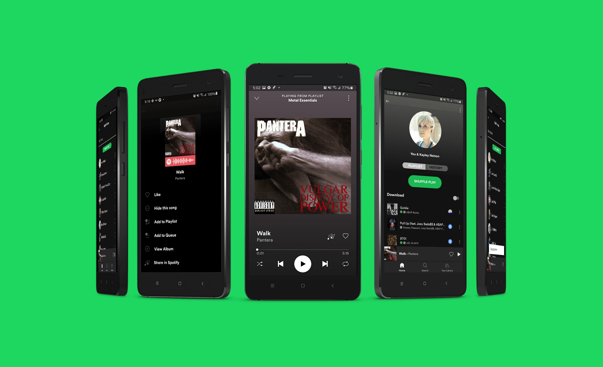
A clickable prototype that showcases a new premium feature for Spotify called "Share in Spotify" (SiS).
RESEARCH
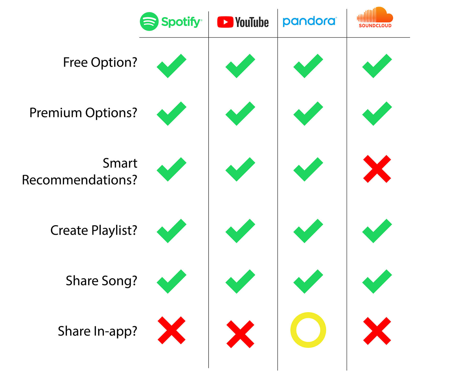
The current state of most music streaming services is that there is no way to share music directly within the platform. The share function 99.9% of the time takes you out of the application to social share via SMS, Facebook, Instagram, etc. My team saw an opportunity to keep engagement within the application to not disrupt a user's listening experience by needing to be taken to another application.
We wanted to know more information on people's current music listening and sharing habits. Not calling out for Spotify users initially we sent out a survey that yielded 30 responses.
Initial Survey Key results
96%
Subscribe to one or more music streaming service
73%
Pay for the premium version of a music streaming service to avoid ads
86%
Are seasoned Spotify Users using the app for 5+ years
80%
Primarily use the android application
Where do you listen to music?
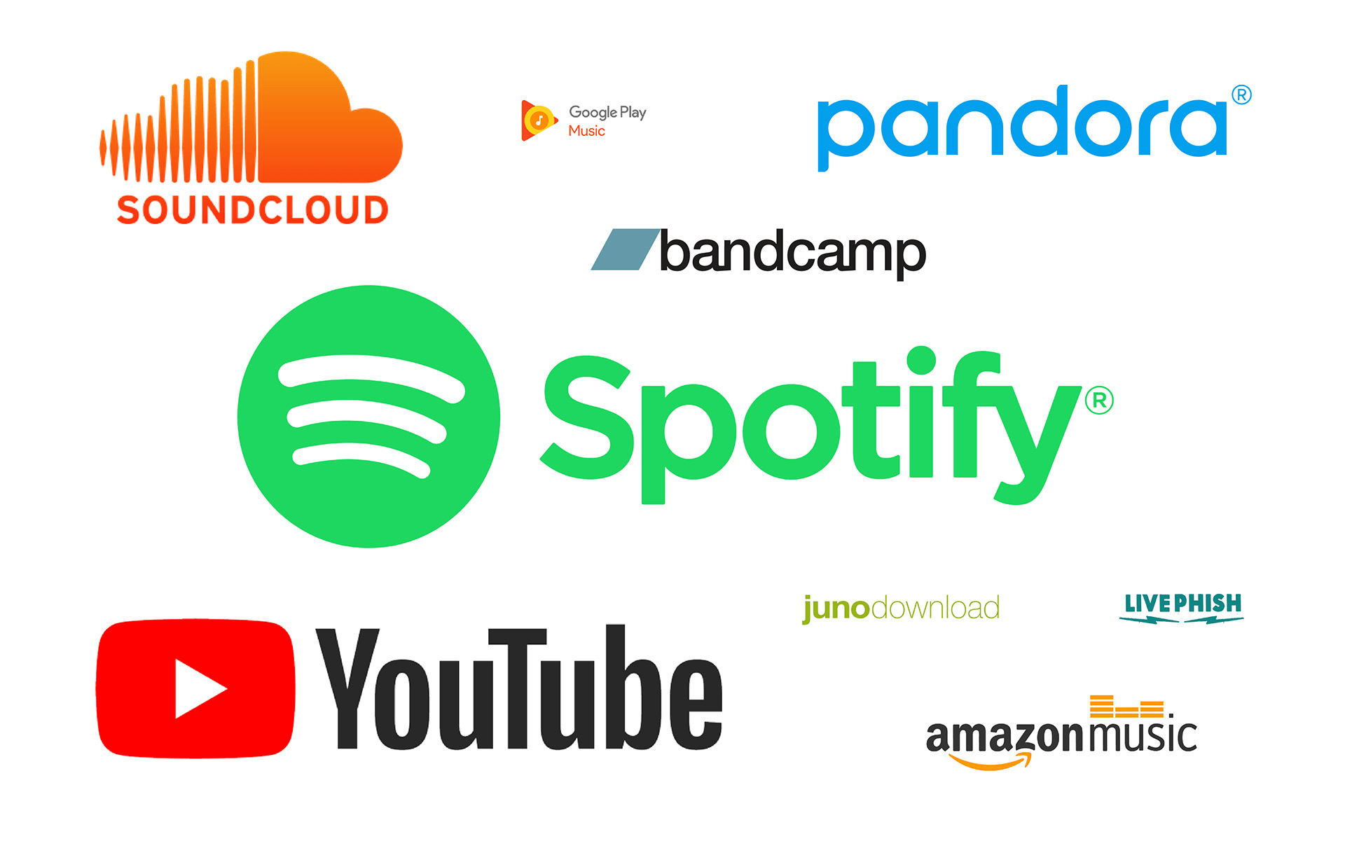
Spotify was the #1 answer. Youtube, Pandora, and Soundcloud were its main competitors. This proved our assumption that designing for Spotify was the right choice.
Competitive Analysis
Do you share music with others?
70% of our participants enjoy both discovering new music and sharing their music with others.
23.3% only like to discover music which showed us that perhaps we needed to design a solution for more than one type of user.
Spotify actually something like this before...
Up until 2017, Spotify had an inbox feature that allowed users to chat and also share music within the app but was later removed due to "low engagement and the high amount of effort to keep the feature active." Removing this feature also took away notifications that informed users of changes that were made to their playlist. Today if you share your playlist with a friend they can delete things off your playlist without your knowledge.
Then why continue building this?
Our Share in Spotify feature would differ from the now removed inbox feature in that there will be no text-based chatting going on (but more on that later). We also saw an opportunity to help others not be so dependent on social media.
Personas
We realized we had 2 types of Spotify users both with different problems:
Ken needs a low-effort way to share music with Kayley that doesn't interrupt his music discovery experience by taking him out of the Spotify application.
Kayley needs a better way to receive music recommendations because she doesn't always remember who shared what song and on what social platform.
The solution for both is: Share in Spotify (SiS)
Users of Spotify share music recommendations within the app
Share music within the app without having to send a social share link. We are making it easier for those who don’t have or like social media to share music directly with other users of Spotify
View a shared history of music recommendations
Spotify users will be able to view a shared history of music recommendations from other users within the Spotify application
Add songs to a
"Shared Playlist"
By heart reacting to a shared song in your "shared history list", it is then added to a "collaborative playlist" that you can both enjoy
We solve Ken’s problem by allowing him to send music recommendations to Kaley in-app without any 3rd party interruptions in 4-5 clicks.
We solve Kayley’s problem by allowing her to have a shared history of what has been sent to her all in one easily accessible place.
DESIGN
User Flows
Sharing a song on Spotify
(Use the green slider to see the current (left) and future user flow (right) )
Currently in Spotify, depending on which social platform you choose to share to you could be 6-12 steps away from sending your song (not including if you choose to edit or delete the auto message).
Our Share in Spotify feature allows for a smooth sharing process all contained within the app in just 4 easy steps!
Icon Design
We wanted to focus on icon creation because we knew if the icon was confusing or unintuitive Spotify users would ignore it and just not engage with the new feature. I lead a design studio session me and 2 other team members each came up with a couple of initial icon options
Icon Survey Results:
Design jam part 2 electric bugaloo, trying to make a more "Spotify-like" icon
One more quick icon survey followed by a usability test
Future State Sitemap
My team needed to consider where this new feature would live within the Spotify application. We needed a place where Spotify users could access their shared playlists they created with fellow users.
We saw an opportunity in Your Library>Music to add a "Shared" section as we wanted to differentiate between playlists you save or create vs the ones you share with other Spotify users and the recommendations they send to you.
Prototype Version 1
Usability Test #1 - 5 Participants
Task #1
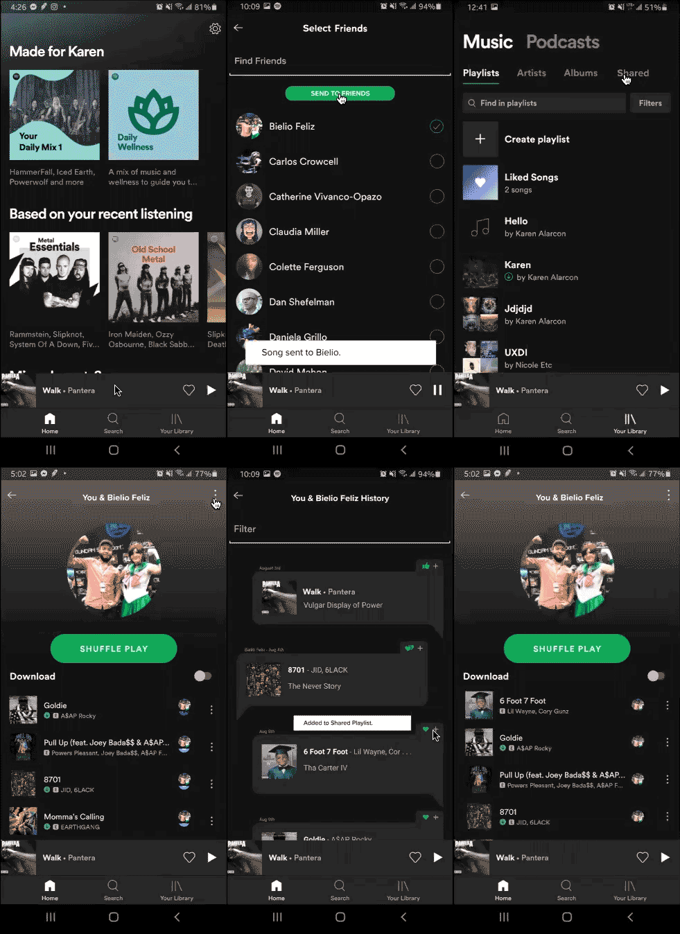
Send the song "Walk" by Pantera to your fellow friend Bielio's Spotify account
Task 1 Results:
- 100% completed Task 1 with an average time of 14 seconds.
- 100% of participants labeled this task to be intuitive
TASK #2
Find the song "6 Foot 7 Foot" by Lil Wayne in your "Shared History" list with Bielio and add it to your
"Shared Playlist"
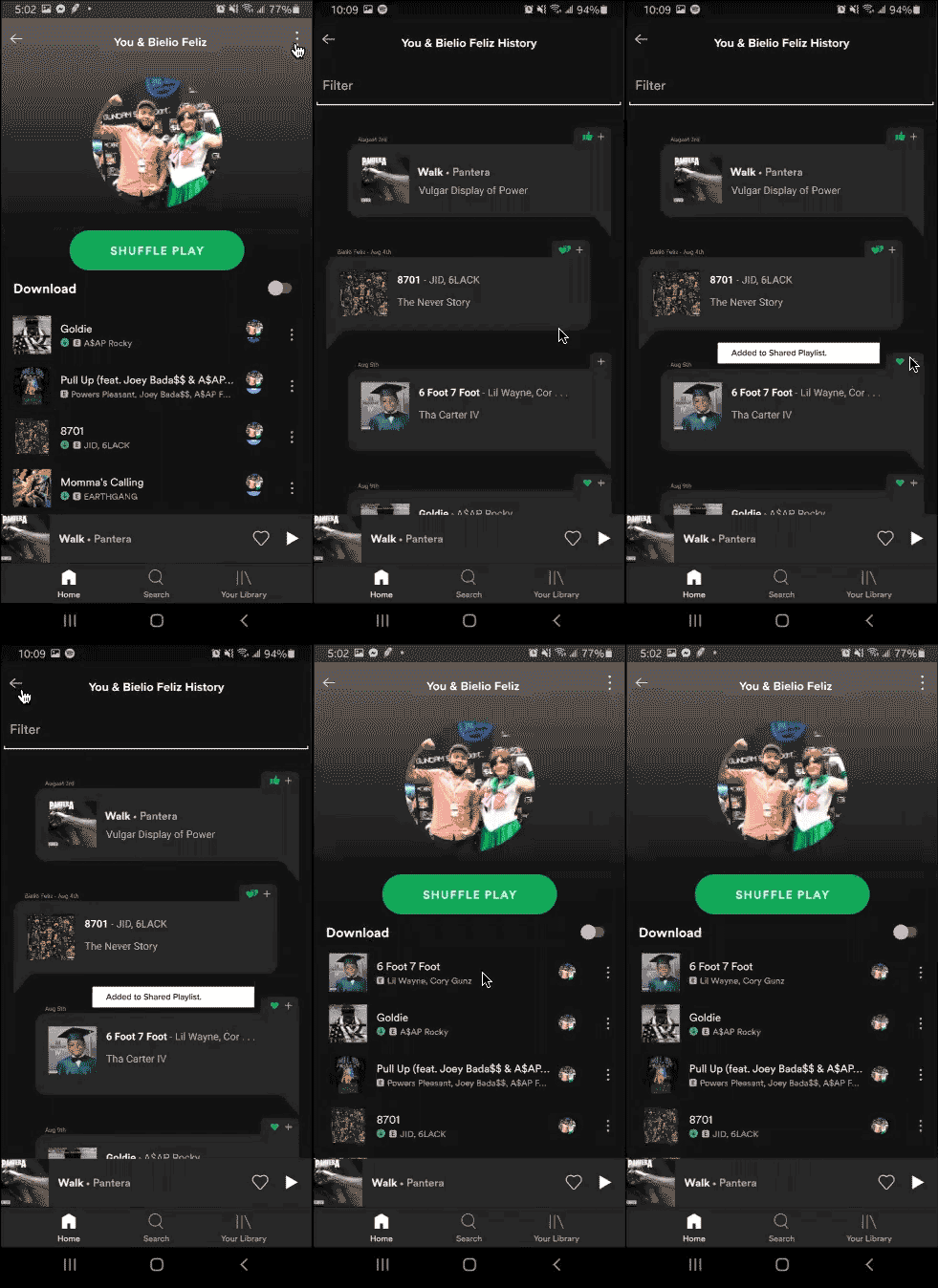
Task 2 Results:
- 80% were able to complete Task 2 with an average time of 55 seconds
- 80% labeled this task as unintuitive
- 90% said in Task 2 it was hard to understand what was the "shared playlist" screen vs the "shared history" screen
- 60% were confused with the 3 icons (thumbs up, thumbs down, and heart) and their functions
Usability Test #1 Design Iterations
Implemented a new button to make it easier to toggle between your "Shared Playlist" and the "Shared History" instead of accessing it from the 3 dots "kebab" menu which would normally take you to a "more options" popover page and not a new page altogether.
Removed the confusing thumbs down/up buttons and just kept the heart icon while also recreating a heart icon they already had to keep brand consistency.
In our first iteration, we initially had a thumbs up, thumbs down, and heart react button with the intention that only the heart react would add the song from the "shared history" to the "shared playlist" while the thumbs up and thumbs down was just to give the users the option to let the other person know if they enjoyed the song or not.
Prototype Version 2
Usability Test #2 - 5 NEW Participants
TASK#1
Send the song "Walk" by Pantera to Kayley
TASK #2
Find the song "6 Foot 7 Foot" by Lil Wayne in your Shared History list with Kayley and add it to your Shared Playlist.
Task 1 Results:
100% of participants completed Task 1 and when asked on a scale of 1-5 (5 being fully confident) the average score was 4.6
Task 2 Results:
- 100% of participants completed Task 2 with average task confidence of 4.4
- 40% would prefer another icon instead of the heart to add a song to the shared playlist
- 40% felt the image of Kayley was taking up too much space not allowing them to focus on the playlist or history page
Current Style Guide
Spotify has very specific and detailed brand guidelines. I loved extracting elements that already existed while incorporating some familiar features from other apps to ease people into this new premium feature.

NEXT STEPS
In both usability tests, all 10 participants were able to complete Task 1 with ease. Most calling out they wished this feature did exist in some capacity. Task 2 however still has a few pain points we need to address and below are some next steps we'd like to take:
- Create a quick onboarding feature to introduce users to the new "Share in Spotify" feature
- Explore and test another icon to replace the "heart". Two usability participants called out a "plus" sign as a possible replacement
- Revisit the visual design for the "Shared Playlist" and "Shared History" pages. The new toggle button we implemented pushed down the important elements and so we need to remove or shrink the account profile image that's taking up prime real estate
- Explore how recommendations between multiple friends will work as it relates to the Share in Spotify feature
- Build out a page where users can search, find and add friends if they don't immediately show up in that "Select Friends" list page
- Explore what notifications might look like when a user receives a new song recommendation within the application
What I learned
• For this project, I challenged myself to step out of my Adobe XD comfort zone and learn to create prototypes in Figma. I always pride myself in learning a new skill and learning it fast and so I was happy with what I could do in just 2 short weeks. I plan to continue to hone my Figma skills and in the future revisit this project to implement the next steps highlighted above
• I wasn't a Spotify user going into this project but through research, testing, and 2 months of free subscription I became well versed in all things Spotify and their offerings
• We originally had 6 participants in our 1st usability test. The results for our 6th participant had to be omitted because as I led the usability test I found myself hand-holding and helping the user go through Task 2 instead of just letting them struggle. This is something I now always remember in all my future usability tests and am so glad I could learn that lesson in this project
Final thoughts, I swear!
As someone who doesn't want to be a slave to social sharing, I think Spotify could benefit from implementing this feature for those who don't want to send or receive messages as Spotify song links across different social platforms. If this feature were to be implemented we predict an increase of Spotify premium users, an increase in the number of friend requests sent out to other Spotify users, and an increase of engagement in the overall application.
What about you? Would you use this feature? If you'd like to view the prototype in its current form check it out here. If you have any comments, suggestions, questions don't be afraid to drop me a line.
More Works...
Client Case Study →
User Interaction | Visual Design | Web Mockup
Client Case Study →UX/UI Design | Heuristic Analysis | Web Prototype
UX Bootcamp Case Study →
UX Design | User Interaction | Android Prototype
Client Case Study →
UX Design | Info. Architect | Interaction Design
UX Bootcamp Case Study →
UX/UI Design | Product Design | Logo & Branding
© Karen Alarcon 2025 | hello@karenalarcon.com | linkedin.com/in/k-alarcon