PARTI GREETINGS
Parti Greetings (or just Parti) is a new digital greeting card web and mobile application.
The Founder, Jeff Luster, wanted UX Designers and Developers to help bring his idea to life while also making sure Parti had all the features that potential customers actually wanted.
Hey there, this is the default text for a new paragraph. Feel free to edit this paragraph by clicking on the yellow edit icon. After you are done just click on the yellow checkmark button on the top right. Have Fun!
My Role
UX Designer
UI Designer
Prototyper
Usability Testing
Timeframe
5 Weeks
June - July 2021
Volunteer UX Project
MakeitMVP
UX Team of 4
Dev Team of 4
Tools Used
Figma
Slack
Google Suite
Zoom
Don't feel like reading?
( But you might need the context ;D )
PROJECT OVERVIEW
The Problem
The current UX Parti team had lost some designers along the way and needed some help in their last 2 design sprints.
What Had Been Done:
- Competitor Analysis
- 8 User Interviews
- Affinity Mapping
- Sitemap and User flows
- Sketches
- Lo-Fi Prototype
- Moodboard & Color Palette
What Was Left To Do:
- Temporary Logo
- Design System
- Usability Testing
- High Fidelity Web Prototype
- High Fidelity Mobile Prototype
My Key Contributions:
- Logo and Icon Design
- Spearheaded the Design System
- Landing page, sign-in, onboarding design for web & mobile
- Prototyping support for Web & Mobile
- 2 Usability Tests
What do you mean by digital greeting cards?
As Covid-19 limited the opportunity for face-to-face celebration digital greeting cards have been on the rise to celebrate popular occasions like birthdays, anniversaries, job promotions and, more.
Creators either recorded their own video or stitched together various videos and photos from other participants to create something personal and custom for the recipient.
Younger demographics opted to just use social media or video chat via Zoom or WhatsApp to commemorate these occasions.
Let's get the Parti started
When I came on board I had a lot of catching up to do. Sifting through, Google Drive, Figma, Figjam I read through all the was done up until this point. The team was eager to get started and gave me the task of creating a logo to represent Parti. (No big deal right?)

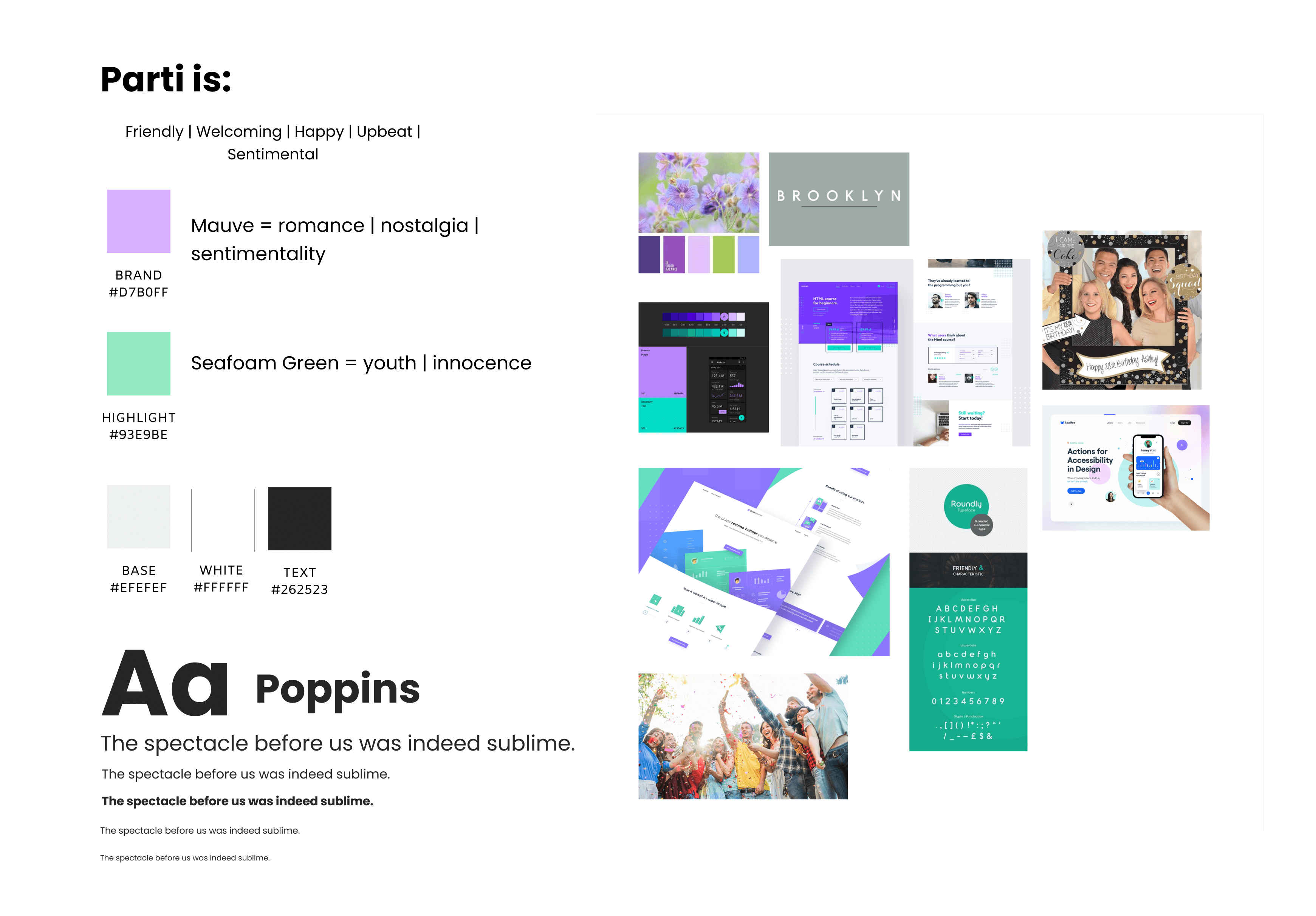
I collected all the available design info about Parti to get a sense of the direction they wanted to go

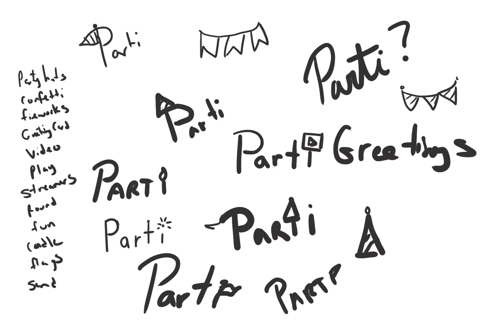
Initial sketches were done in Photoshop

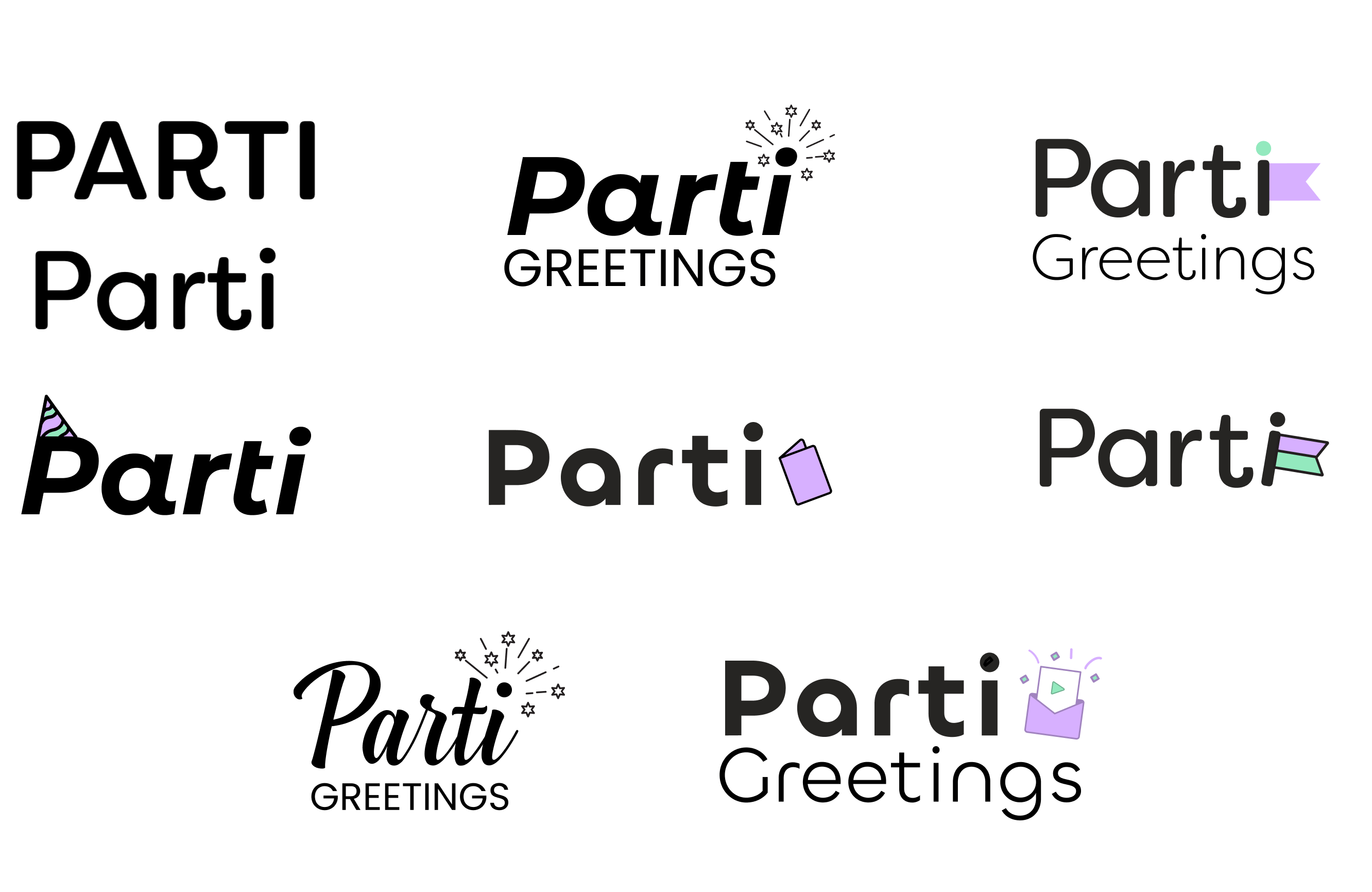
I went through various iterations and tried different types of fonts, elements, playing around in Figma to see if anything stuck out.
There Can Only Be One
This combination mark was ultimately chosen. A clean round, bold, sans serif font with a card with a play button (to signify the video aspect of the app) coming out of an envelope with fun confetti coming out (surprise!).
This logo allows for flexibility as you can take some elements away but still keeping true to the brand we are creating.
Is it perfect? No. If I had more time I'd love to refine it further. This was a jumping-off point and helped set the friendly, upbeat tone we were after.

To Be Continued...
Sorry folks this case study is still in progress. Please check back a little later to see the rest~
Can't wait and want to know more? Email me and let's chat!
More Works...
Client Case Study →
User Interaction | Visual Design | Web Mockup
Client Case Study →UX/UI Design | Heuristic Analysis | Web Prototype
UX Bootcamp Case Study →
UX Design | User Interaction | Android Prototype
Client Case Study →
UX Design | Info. Architect | Interaction Design
UX Bootcamp Case Study →
UX/UI Design | Product Design | Logo & Branding
© Karen Alarcon 2025 | hello@karenalarcon.com | linkedin.com/in/k-alarcon