Meet Sensia IQ
Sensia IQ is a Houston-based salon/spa with a 30-year history in makeup. They sought a website redesign to better represent their elegant brand.
My Role
UX Designer
UI Designer
Timeframe
9 Weeks
Aug - Oct 2021
Remote Project with
Meraki Vision
Tools Used
Adobe XD
Slack
Monday
My design focus
The client provided a brief outlining their mission and desired website improvements. They aimed for:
- Purposeful site layout
- Feminine colors
- High-quality, natural beauty-focused makeup
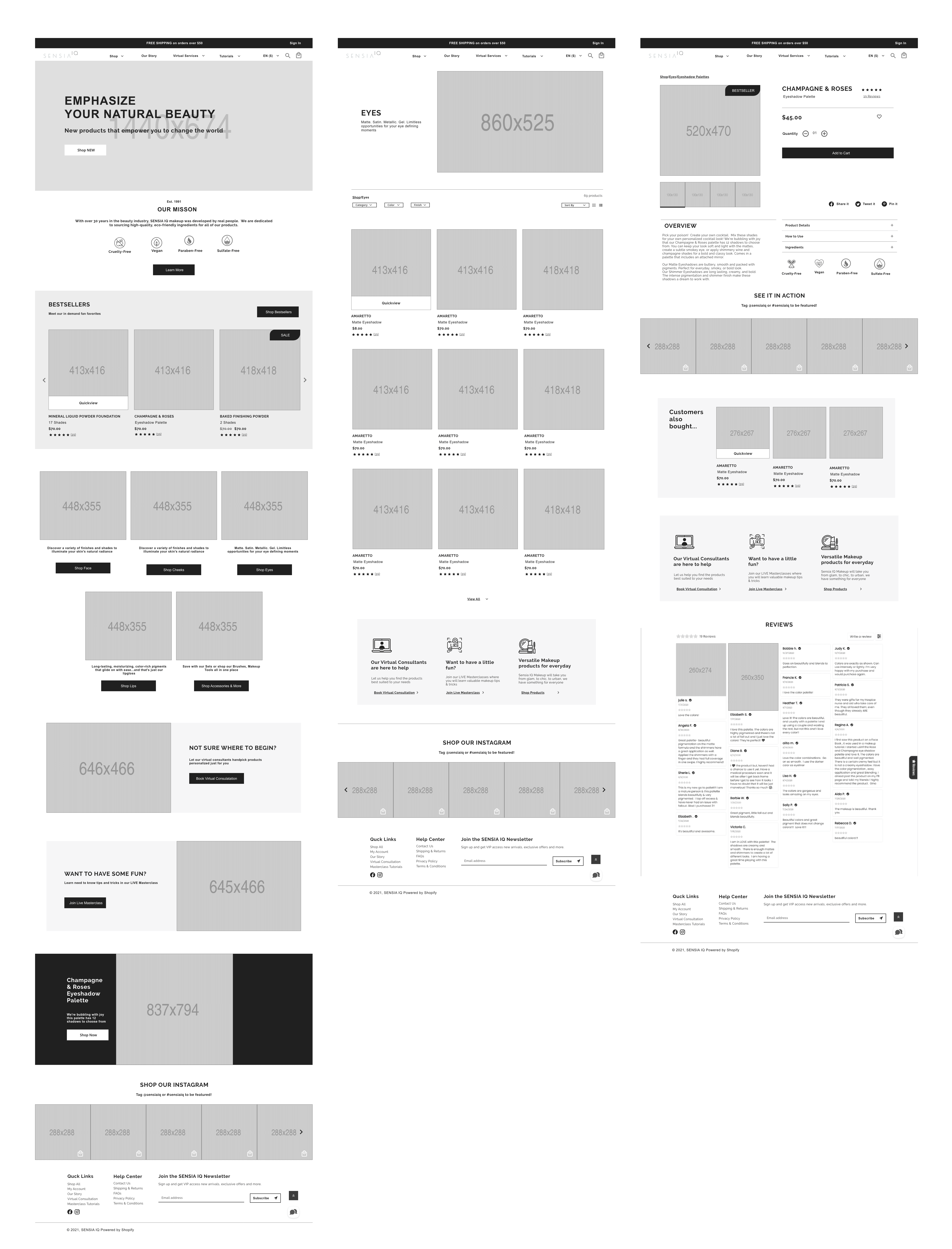
I was asked to concentrate on three pages: the homepage, collection page, product page, and a style guide. I began by assessing the existing site for improvements. I was also asked to recommend a suitable Shopify theme which came with their own constraints.
User testing was skipped due to budget constraints, relying instead on market research, the client brief, my e-commerce experience, and makeup consumer insights.
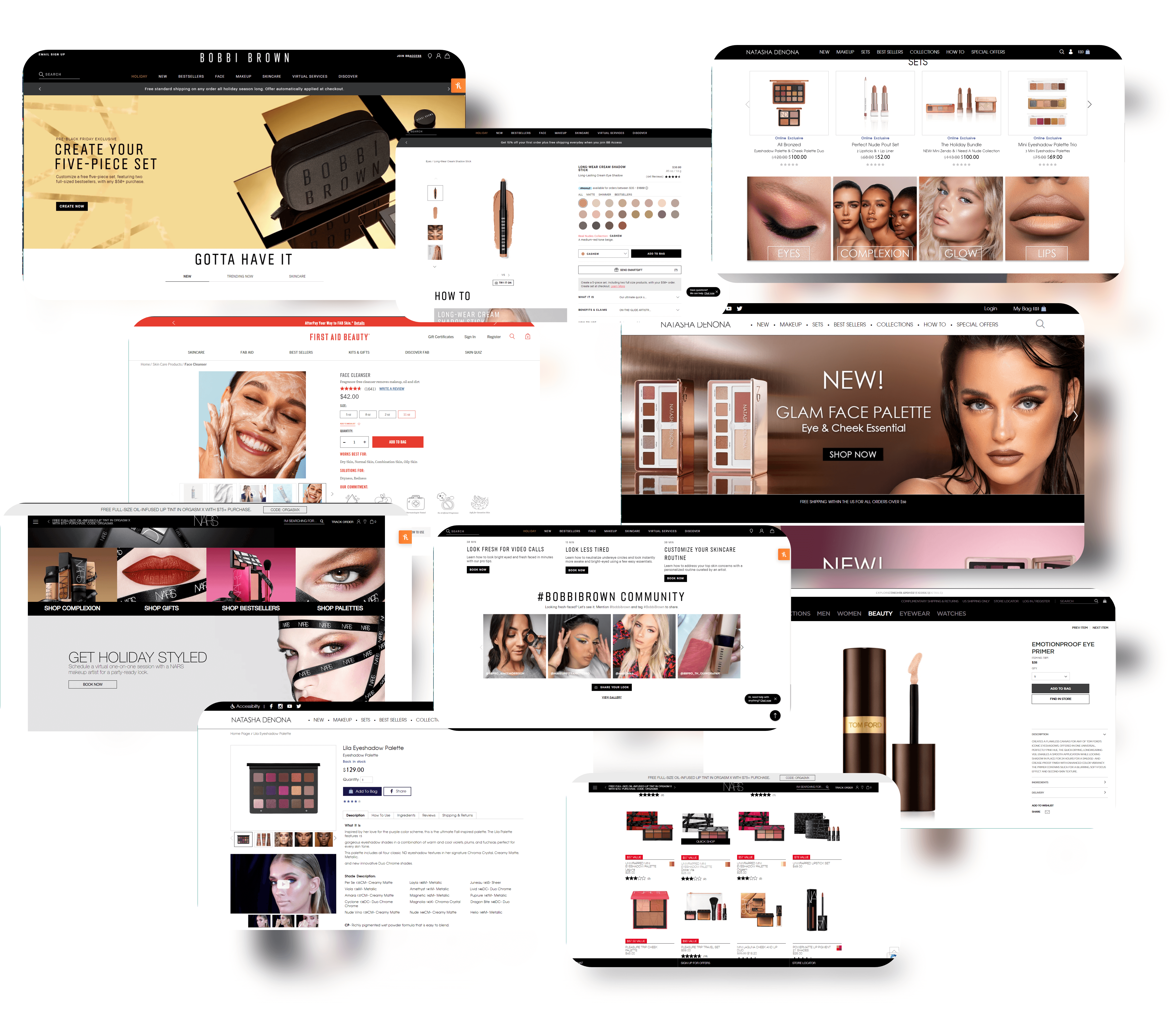
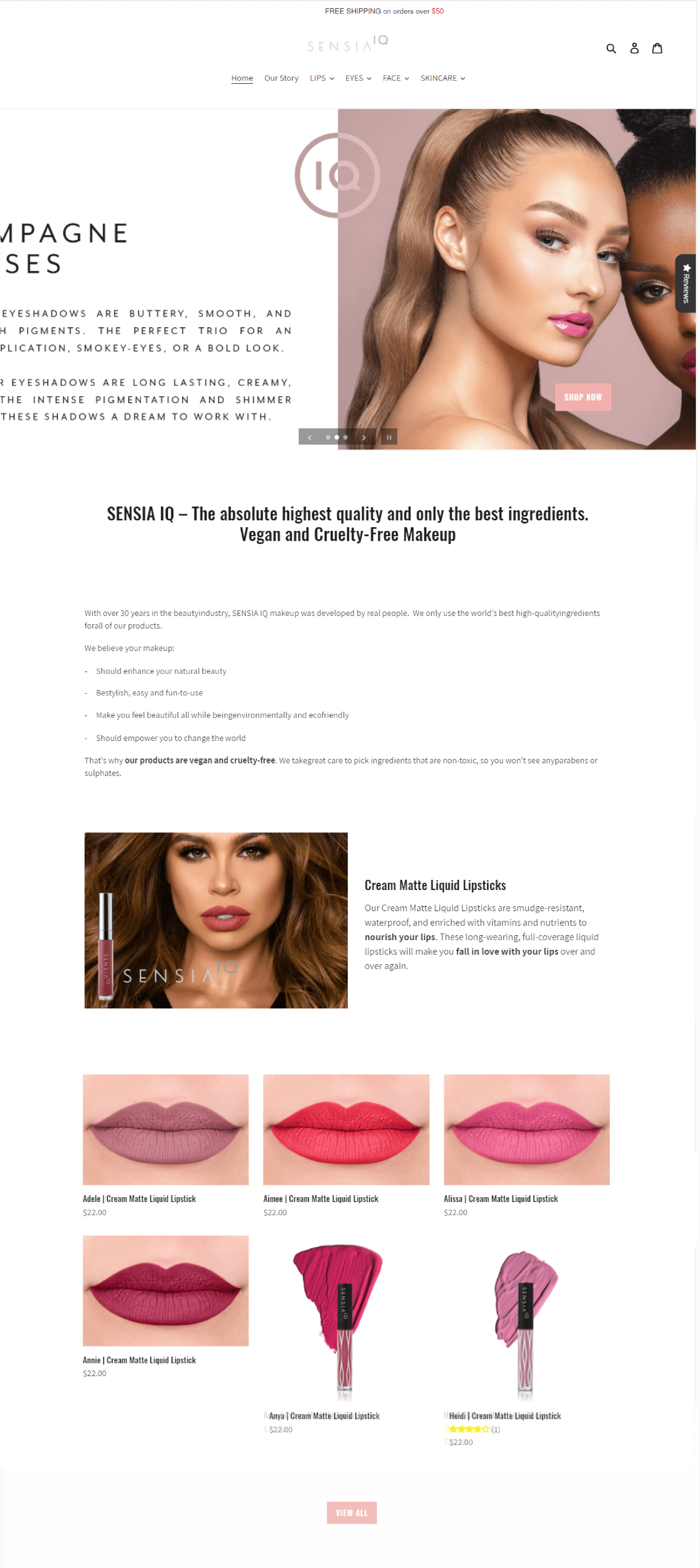
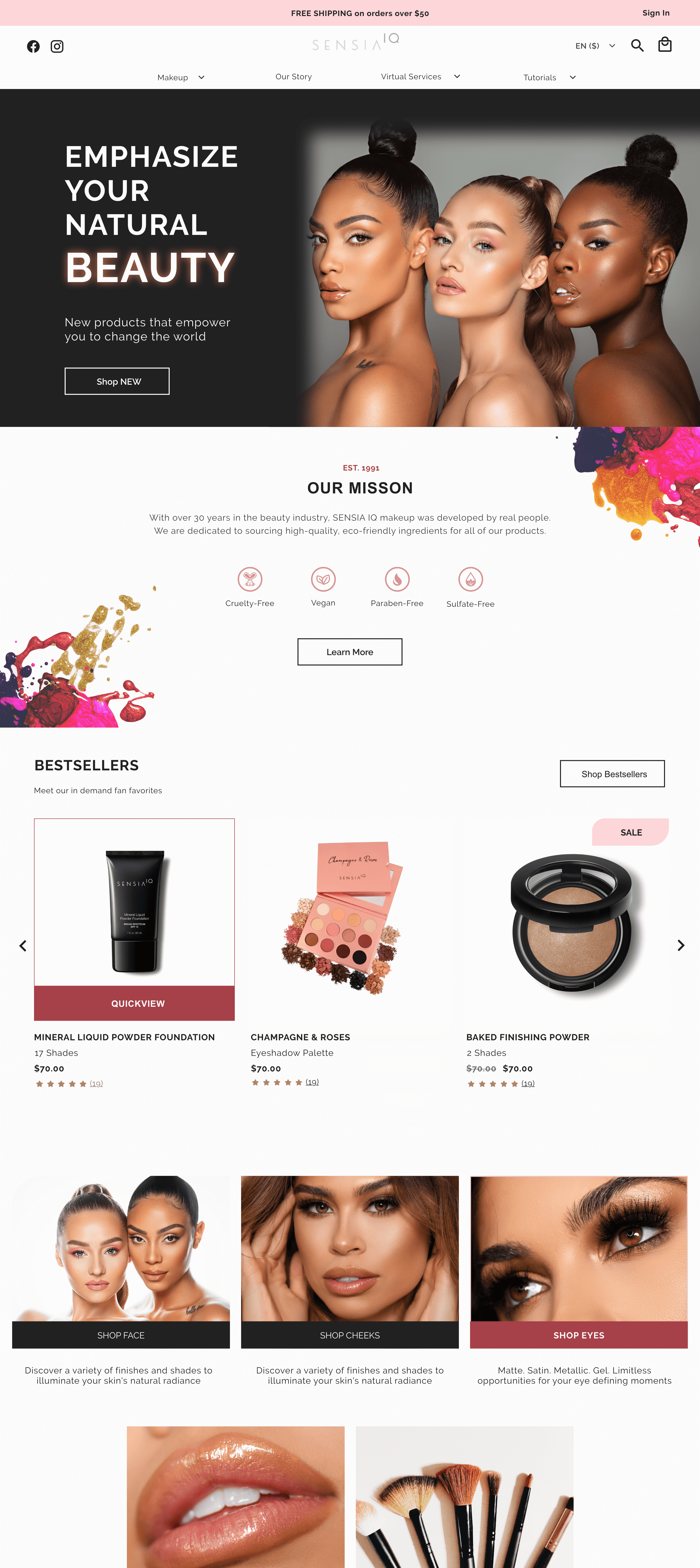
Current vs. Final: Homepage
(Use the slider to compare)
- Updated banner with stunning Sensia IQ photography
- Highlighted mission statement to convey uniqueness
- Showcased multiple products to reflect their wide range
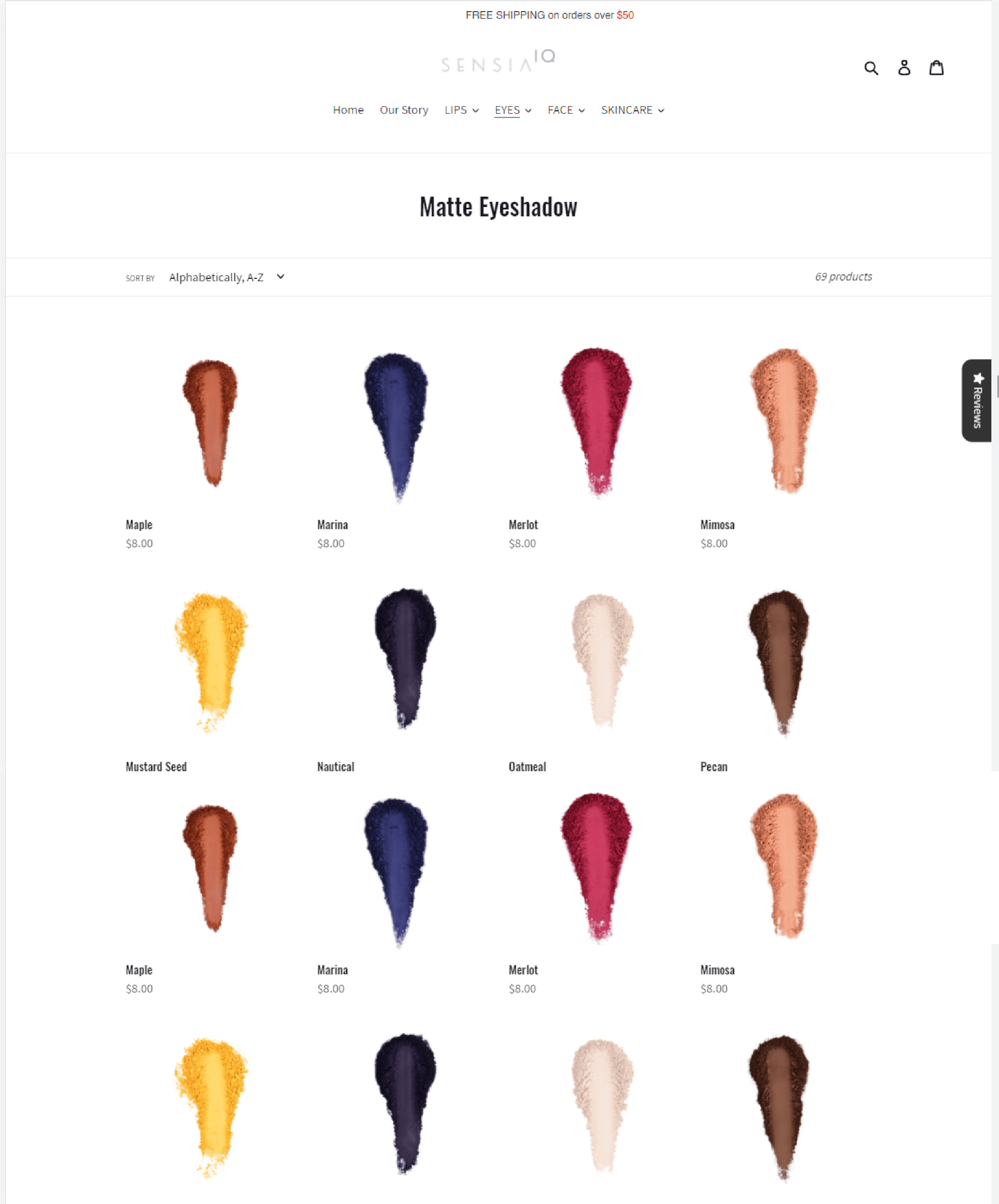
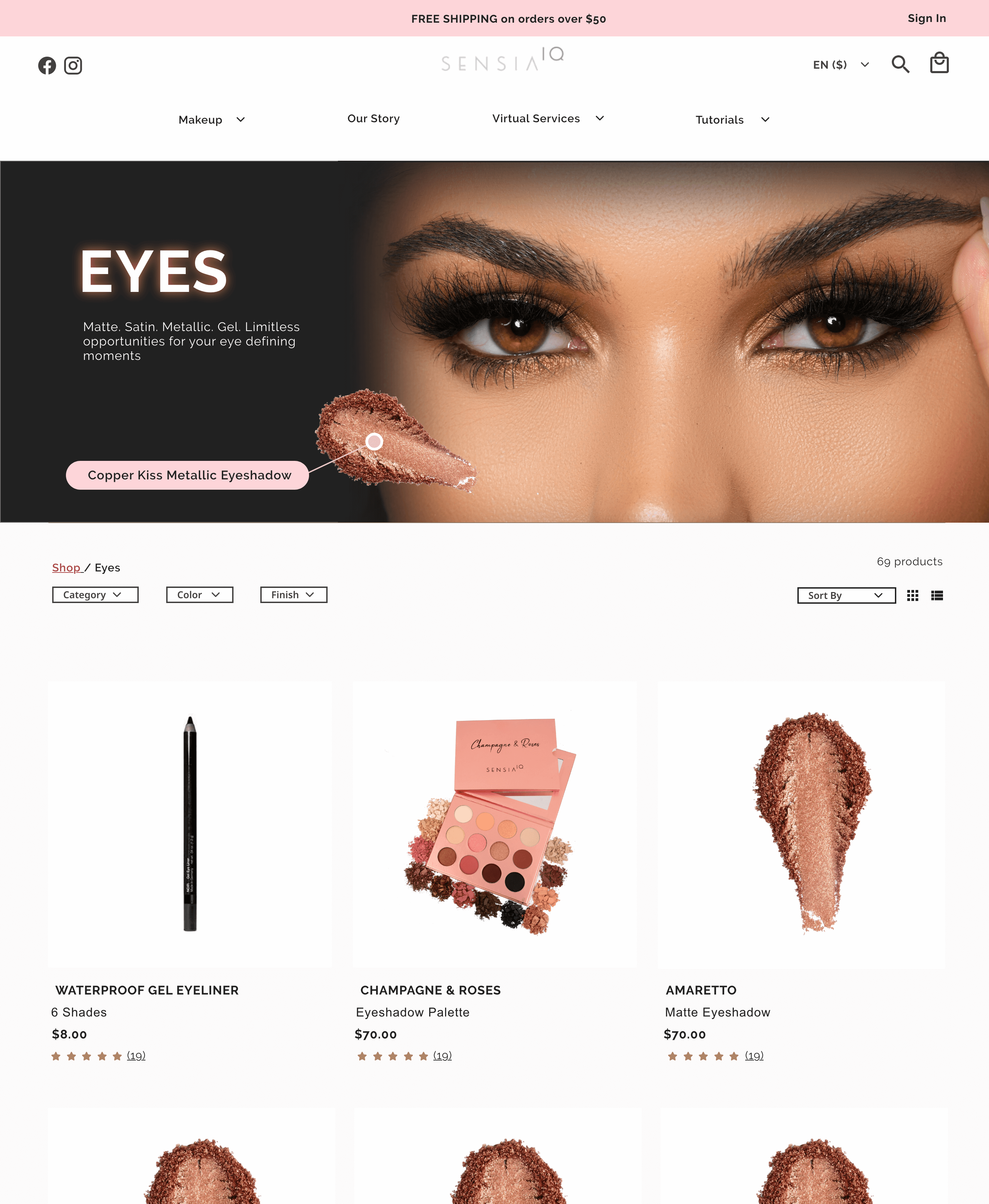
Current vs. Final: Collection Page
(Use the slider to compare)
- Created eye-catching banner template for categories
- Added filter options to enhance product search
- Included descriptive product titles for clarity
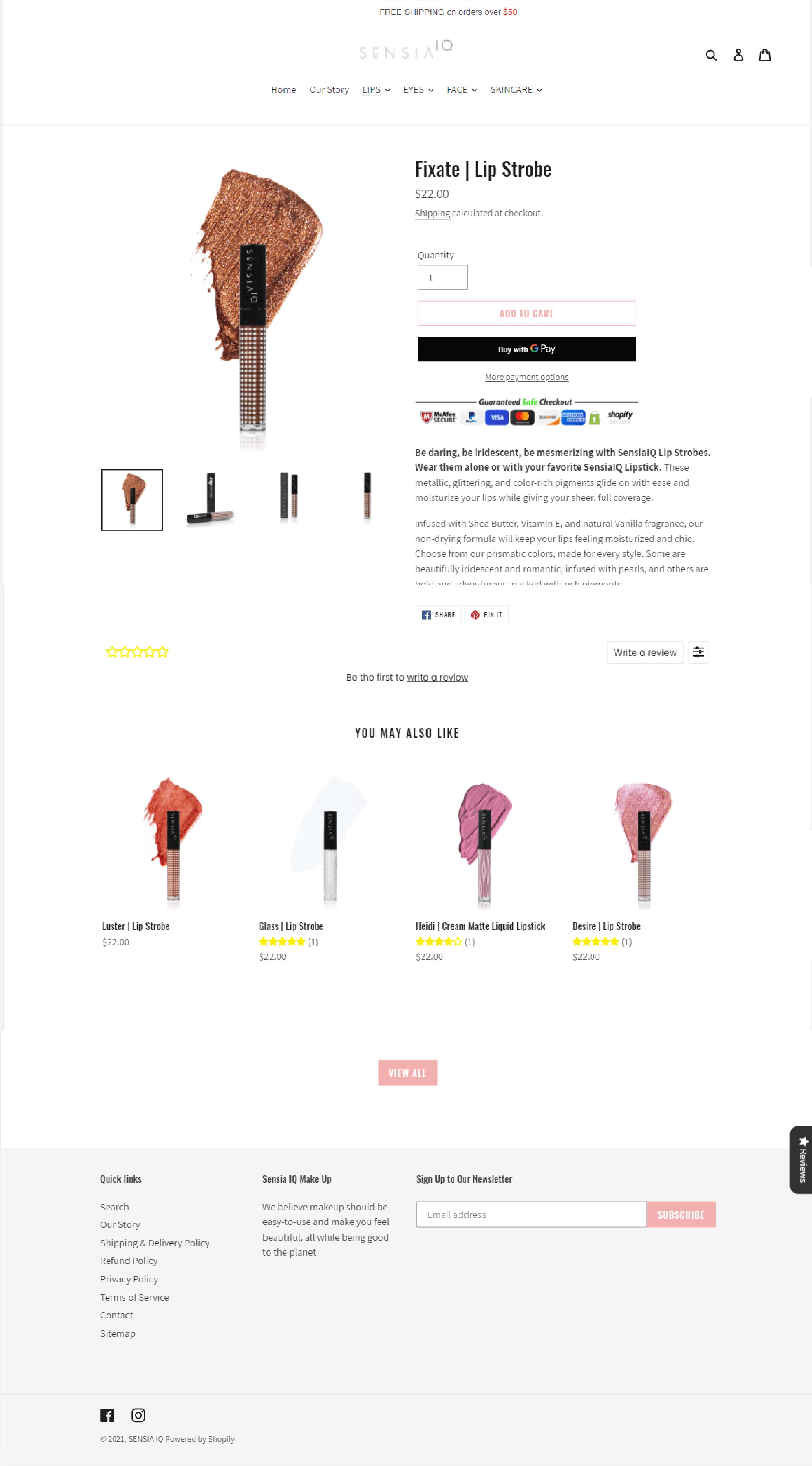
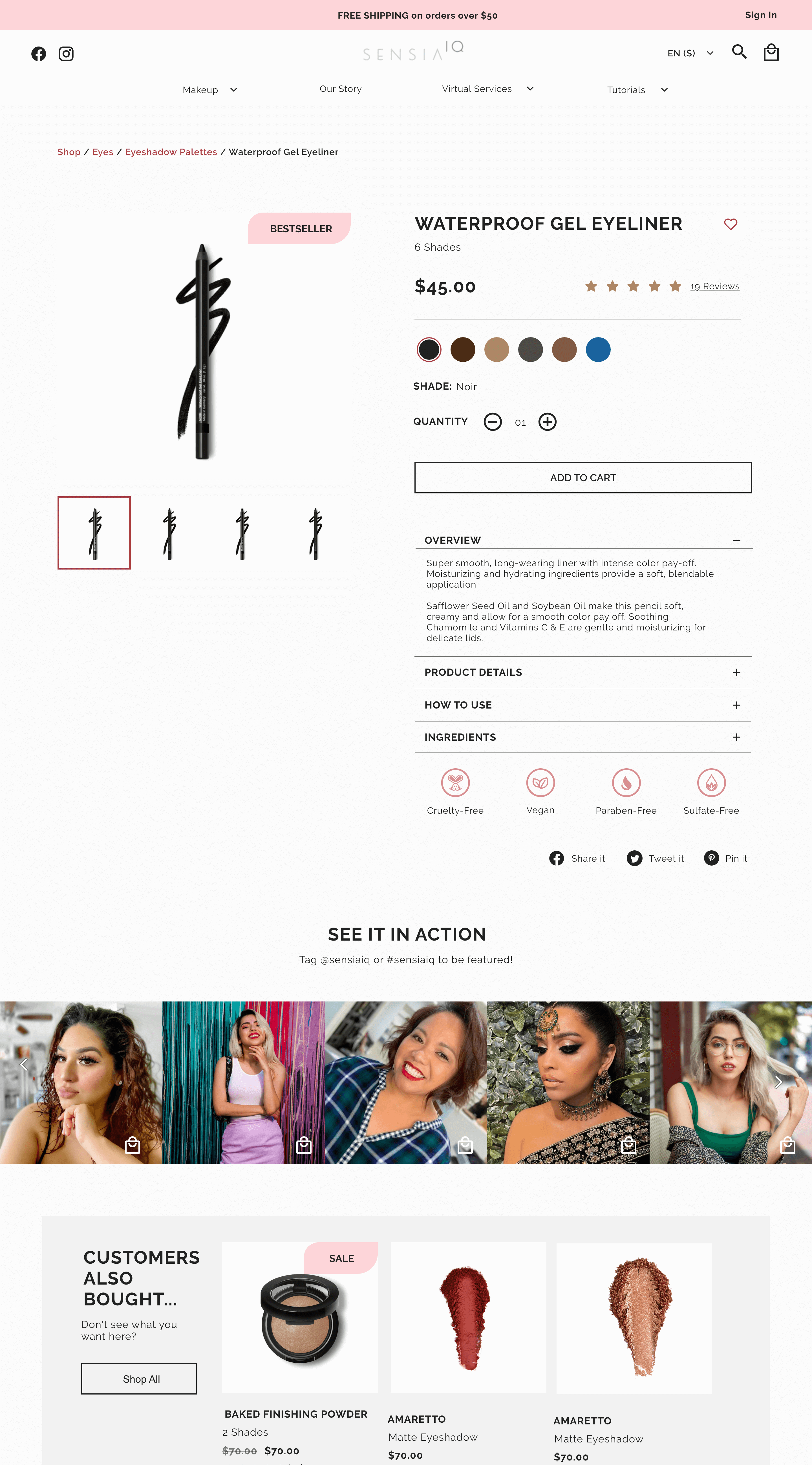
The Current vs. Final Product Page
(Use the slider to compare)
- Enabled the 'Save for Later' feature
- Emphasized Sensia IQ's vegan, paraben-free, cruelty-free, and sulfate-free products
- Integrated Instagram feed with relevant hashtags for social proof
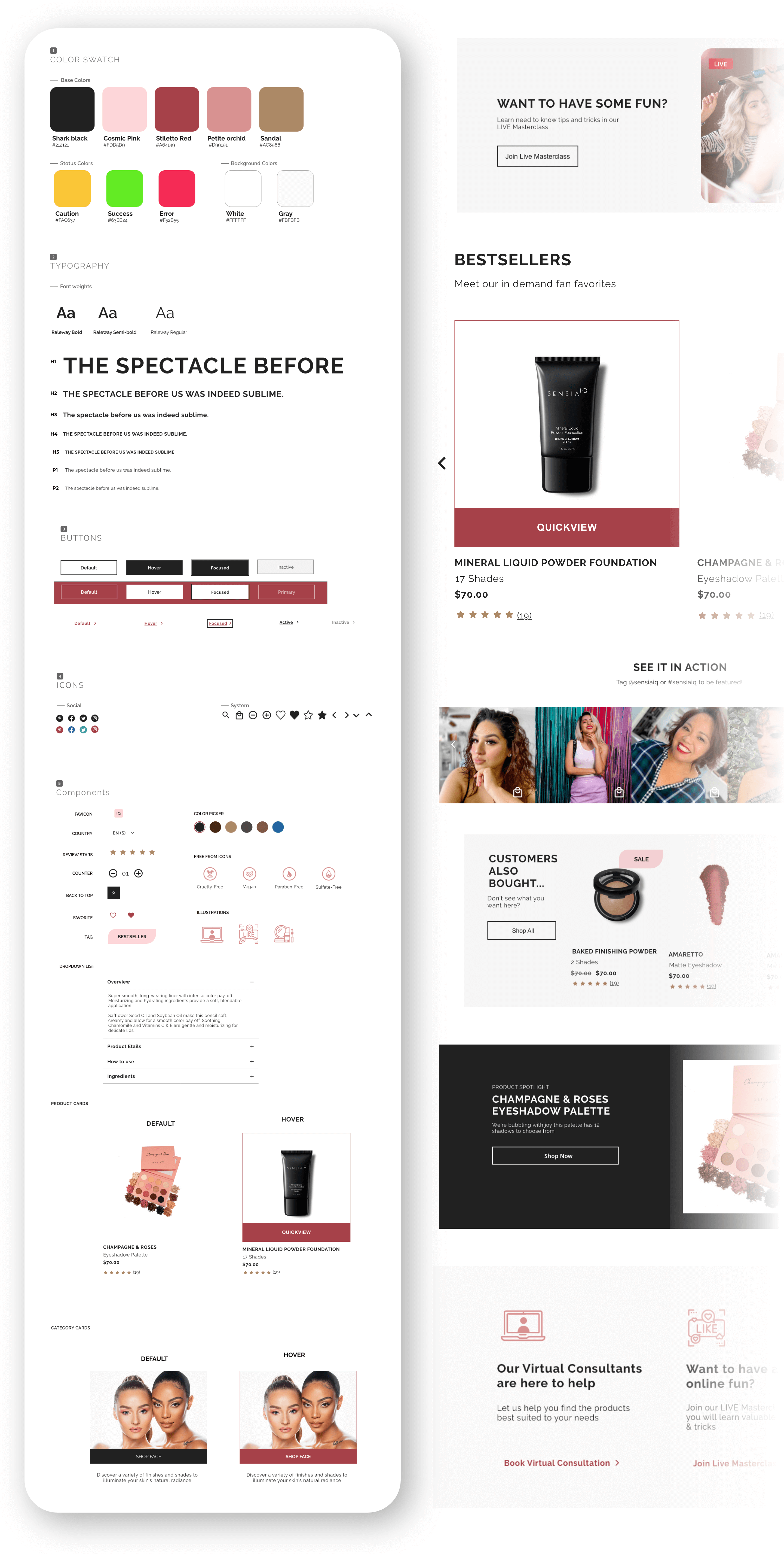
Final thoughts
While I regret not conducting user testing, I'm pleased with the overall layout's endurance. I'd revisit the style guide to enhance UI elements and add accessible color combination recommendations.
Sensia IQ's mission of enhancing natural beauty made this project meaningful. Increased product reviews demonstrate customer empowerment and engagement.
Thank you for reading!
Questions? Suggestions?
Feel free to contact me below~
More Works...
Client Case Study →
User Interaction | Visual Design | Web Mockup
Client Case Study →UX/UI Design | Heuristic Analysis | Web Prototype
UX Bootcamp Case Study →
UX Design | User Interaction | Android Prototype
Client Case Study →
UX Design | Info. Architect | Interaction Design
UX Bootcamp Case Study →
UX/UI Design | Product Design | Logo & Branding
© Karen Alarcon 2025 | hello@karenalarcon.com | linkedin.com/in/k-alarcon